The most commonly reported measure of classifier performance is accuracy: the percentage of correct classifications obtained. This metric has the advantage of being easy to understand and makes comparison of the performance of different classifiers trivial, but it ignores many of the factors which should be taken into account when honestly assessing the performance of a classifier.
Classifier performance is more than just a count of correct classifications. Consider, for example, the problem of screening for a relatively rare condition such as cervical cancer, which has a prevalence of about 10% (actual stats). If a lazy Pap smear screener was to classify every slide they see as “normal”, they would have a 90% accuracy. Very impressive. But that figure completely ignores the fact that the 10% of women who do have the disease have not been diagnosed at all.
Most classifiers produce a score, which is then thresholded to decide the classification. If a classifier produces a score between 0.0 (definitely negative) and 1.0 (definitely positive), it is common to consider anything over 0.5 as positive.
However, any threshold applied to a dataset (in which PP is the positive population and NP is the negative population) is going to produce true positives (TP), false positives (FP), true negatives (TN) and false negatives (FN).
Once you have numbers for all of these measures, some useful metrics can be calculated.
- Accuracy = (1 — Error) = (TP + TN)/(PP + NP) = Pr(C), the probability of a correct classification.
- Sensitivity = TP/(TP + FN) = TP/PP = the ability of the test to detect disease in a population of diseased individuals.
- Specificity = TN/(TN + FP) = TN / NP = the ability of the test to correctly rule out the disease in a disease-free population.
One way to overcome the problem of having to choose a cut-off is to start with a threshold of 0.0, so that every case is considered as positive. We correctly classify all of the positive cases, and incorrectly classify all of the negative cases. We then move the threshold over every value between 0.0 and 1.0, progressively decreasing the number of false positives and increasing the number of true positives.
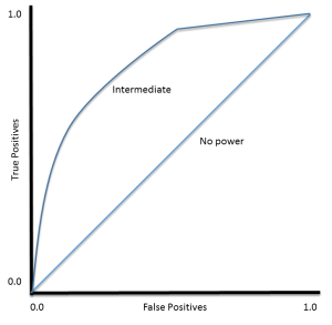
TP (sensitivity) can then be plotted against FP (1 — specificity) for each threshold used. The resulting graph is called a Receiver Operating Characteristic (ROC) curve:
ROC curves were developed for use in signal detection in radar returns in the 1950’s, and have since been applied to a wide range of problems.
For a perfect classifier the ROC curve will go straight up the Y axis and then along the X axis. A classifier with no power will sit on the diagonal, whilst most classifiers fall somewhere in between.
ROC analysis provides tools to select possibly optimal models and to discard suboptimal ones independently from (and prior to specifying) the cost context or the class distribution
— Wikipedia article on Receiver Operating Characteristic
Threshold Selection
It is immediately apparent that the ROC curve can be used to select a threshold for a classifier which maximises the true positives, while minimising the false positives.
However, different types of problems have different optimal classifier thresholds. For a cancer screening test, for example, we may be prepared to put up with a relatively high false positive rate in order to get a high true positive, it is most important to identify possible cancer sufferers.
For a follow-up test after treatment, however, a different threshold might be more desirable, since we want to minimise false negatives, we don’t want to tell a patient they’re clear if this is not actually the case.
Performance Assessment
ROC curves also give us the ability to assess the performance of the classifier over its entire operating range. The most widely-used measure is the area under the curve (AUC). The AUC for a classifier with no power, essentially random guessing, is 0.5, because the curve follows the diagonal. The AUC for that mythical being, the perfect classifier, is 1.0. Most classifiers have AUCs that fall somewhere between these two values.
An AUC of less than 0.5 might indicate that something interesting is happening. A very low AUC might indicate that the problem has been set up wrongly, the classifier is finding a relationship in the data which is, essentially, the opposite of that expected. In such a case, inspection of the entire ROC curve might give some clues as to what is going on: have the positives and negatives been mislabelled?
The AUC can be used to compare the performance of two or more classifiers. A single threshold can be selected and the classifiers’ performance at that point compared, or the overall performance can be compared by considering the AUC.