Measuring the Performance
We have built different clustering algorithms, but haven’t measured their
performance.
- In supervised learning, the predicted values with the original labels are
compared to calculate their accuracy. - In contrast, in unsupervised learning, we have no labels, so we need to find a way to measure the performance of our algorithms.
A good way to measure a clustering algorithm is by seeing how well the clusters are separated. Are the clusters well separated? Are the data points in a cluster that is tight enough?
We need a metric that can quantify this behaviour. We will use a metric called
the silhouette coefficient score. This score is defined for each datapoint; this coefficient is defined as follows:
Here,
x is the average distance between the current data point and all the other data points in the same cluster
y is the average distance between the current data point and all the
datapoints in the next nearest cluster.
Let’s see how to evaluate the performance of clustering algorithms:
- Import the following packages:
import numpy as np
import matplotlib.pyplot as plt
from sklearn import metrics
from sklearn.cluster import KMeans
2. Let’s load the input data from the data_perf.txt file that can be downloaded from here https://github.com/appyavi/Dataset
input_file = ('data_perf.txt')
x = []
with open(input_file, 'r') as f:
for line in f.readlines():
data = [float(i) for i in line.split(',')]
x.append(data)
data = np.array(x)
3. In order to determine the optimal number of clusters, let’s iterate through a range of values and see where it peaks:
scores = []
range_values = np.arange(2, 10)
for i in range_values:
# Train the model
kmeans = KMeans(init='k-means++', n_clusters=i, n_init=10)
kmeans.fit(data)
score = metrics.silhouette_score(data, kmeans.labels_, metric='euclidean', sample_size=len(data))
print("Number of clusters =", i)
print("Silhouette score =", score)
scores.append(score)
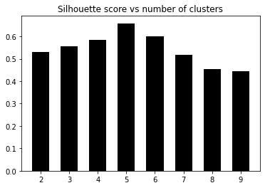
OUTPUT:
Number of clusters = 2
Silhouette score = 0.5290397175472954
Number of clusters = 3
Silhouette score = 0.5551898802099927
Number of clusters = 4
Silhouette score = 0.5832757517829593
Number of clusters = 5
Silhouette score = 0.6582796909760834
Number of clusters = 6
Silhouette score = 0.5991736976396735
Number of clusters = 7
Silhouette score = 0.517456403808953
Number of clusters = 8
Silhouette score = 0.4527964479438083
Number of clusters = 9
Silhouette score = 0.44285981549509906
4. Now let’s plot the graph to see where it peaked:
# Plot scores
plt.figure()
plt.bar(range_values, scores, width=0.6, color='k', align='center')
plt.title('Silhouette score vs number of clusters')
# Plot data
plt.figure()
plt.scatter(data[:,0], data[:,1], color='k', s=30, marker='o',
facecolors='none')
x_min, x_max = min(data[:, 0]) - 1, max(data[:, 0]) + 1
y_min, y_max = min(data[:, 1]) - 1, max(data[:, 1]) + 1
plt.title('Input data')
plt.xlim(x_min, x_max)
plt.ylim(y_min, y_max)
plt.xticks(())
plt.yticks(())
plt.show()
We can visually confirm that the data, in fact, has five clusters. We just took the example of a small dataset that contains five distinct clusters. This method
becomes very useful when you are dealing with a huge dataset that contains high- dimensional data that cannot be visualized easily.
The sklearn.metrics.silhouette_score function computes the mean silhouette
coefficient of all the samples. For each sample, two distances are calculated: the mean intra- cluster distance (x), and the mean nearest-cluster distance (y). The silhouette coefficient for a sample is given by the following equation:
Essentially, y is the distance between a sample and the nearest cluster that does not include the sample.
There’s more…
The best value is 1, and the worst value is -1. 0 represents clusters that overlap, while values of less than 0 mean that that particular sample has been attached to the wrong cluster.