Load Libraries
First, we need to load tidyverse, FactoMineR, factoextra, and readxl into our R environment. If you get an error about the packages not being recognized, uncomment (remove the #) before the install.packages() line(s) that you need.
# Install if needed by removing the #
# install.packages("tidyverse")
# install.packages("readxl")
# install.packages("FactoMineR")
# install.packages("factoextra")# Load Libraries
library(tidyverse)
library(readxl)
library(FactoMineR)
library(factoextra)
It would also benefit you to set your working directory into a folder that contains your file and has room to download a .xls file. That can be done with the setwd() command or using RStudio to navigate the Files menu to the folder location and setting the working directory with the More drop down menu as shown below:
Download the Data
Now we need to download the data. The link to the web page can be found here [2] or in the RMD file from my GitHub if you want to explore The Heritage Foundation’s website a bit more to learn about the data. Click the “Download Raw Data” button at the top of the page and you should get a file named index2020_data.xls that we will use for the rest of the project.
Import the Data
The easiest thing to do is to navigate to the folder with the data, click on it, and automatically pull up the readxl graphic interface. I went ahead and renamed my data to EFI_data for simplicity and sanity. These screenshots should help:
After changing the name and hitting the Import button, RStudio will automatically generate some code to your console. It’s a good idea to copy/paste the first line without the “>” into the file to be able to quickly load the data again later. Here’s what that looks like:
The code should look like this:
# Import Data
EFI_data <- read_excel("index2020_data.xls")
Initial Look at the Data
When possible, it is always a good idea to take a quick look through the data to see if there are any obvious problem that need to be solved before we do the fun stuff.
Here’s a screenshot of some of the data in the middle. Let’s see what jumps out.
What jumps out at me is that missing data is labeled “N/A”, which I know R will not like. The numbers also look pretty strange where some are short and sweet while others have way too many decimal places. Also, the keen among us noticed that in the data import phase that all of the columns that are supposed to be numeric are actually characters. We will have to resolve the data type issues as well.
Clean the Data
First, let’s get rid of the “N/A” issue. There are many ways to go about doing this, but I am going to rely on a trick of R and “trust the magic” a little bit. To avoid complication in the following steps, just trust me that we should get the original column names from the EFI_data before moving on. Let’s use this code:
# Get original column names
EFI_data_col_names <- names(EFI_data)
Next, we are going to use the lapply() function and put the gsub() function inside of a custom function() to find any occurrence of the string “N/A” and replace it with nothing. When we structure the function like this, we rely on the speed of lapply() to perform the adjustment much faster than if a for loop were to be used because of the single-threaded nature of R [1]. In a future step, we will rely on R to coerce the empty data into the proper NA format. Scroll through the data to see the result for yourself.
Here’s the code:
# Fix "N/A" in the data set
EFI_data <- data.frame(lapply(EFI_data, function(x) {
gsub("N/A", "", x)
}))
While this function does what we want it do in the data itself, R thinks it is a good idea to automatically change the column names. It’s annoying and messy, so let’s put the original names back with this code:
# Put the right column names back
names(EFI_data) <- EFI_data_col_names
Time for a custom function!
Let’s make one to change all those columns that are characters to numeric and round them to two decimal places while we’re at it. We will plug this custom function into the next step.
Here’s the code:
# Create custom function to fix data types and round
to_numeric_and_round_func <- function(x){
round(as.numeric(as.character(x)),2)
}
With our custom function created, we will use the mutate_at() function to change all the columns except the four columns that are supposed to remain text.
Here’s the code:
# Mutate the columns to proper data type
EFI_data <- EFI_data %>%
mutate_at(vars(-one_of("Country Name", "WEBNAME", "Region", "Country")), to_numeric_and_round_func)
Realistically, we do not need the Country or WEBNAME for the actual analysis, so we will remove them now by just making them NULL with this code:
# Remove Country and WEBNAME
EFI_data$Country <- NULL
EFI_data$WEBNAME <- NULL
K-Means Clustering
There are two main ways to do K-Means analysis — the basic way and the fancy way.
Basic K-Means
In the basic way, we will do a simple kmeans() function, guess a number of clusters (5 is usually a good place to start), then effectively duct tape the cluster numbers to each row of data and call it a day. We will have to get rid of any missing data first, which can be done with this code:
# create clean data with no NA
clean_data <- EFI_data %>%
drop_na()
We also want to set the seed so that we ensure reproducibility with this code:
# Set seed
set.seed(1234)
Here is the code for the basic K-Means method:
# Cluster Analysis - kmeans
kmeans_basic <- kmeans(clean_data[,7:32], centers = 5)
kmeans_basic_table <- data.frame(kmeans_basic$size, kmeans_basic$centers)
kmeans_basic_df <- data.frame(Cluster = kmeans_basic$cluster, clean_data)# head of df
head(kmeans_basic_df)
Here’s the output:
This shows that the cluster number added to each row of the data.
We can also look at the properties (centers, size) of each cluster with the kmeans_basic_table here:
We can also explore each row of the data with the cluster number in the kmeans_basic_df object like this:
For many, the basic way will get you as far as you need to go. From here, you can do graphs by region, data for each cluster, or anything you want.
I created a quick ggplot() example breaking down the count of each cluster by the region. We could do dozens of different plots, but this is a good, simple demonstration.
Here’s the code:
# Example ggplot
ggplot(data = kmeans_basic_df, aes(y = Cluster)) +
geom_bar(aes(fill = Region)) +
ggtitle("Count of Clusters by Region") +
theme(plot.title = element_text(hjust = 0.5))
Here’s the output:
Fancy K-Means
The first task is to figure out the right number of clusters. This is done with a scree plot. Essentially, the goal is to find where the curve starts to flatten significantly [1]. Since the K-Means algorithm is effectively minimizing the differences between the centers of the clusters and each point of data, this shape of curve that starts steep then asymptotically approaches some level of a flat line is created [1]. While not a complete requirement, it is generally a good idea to scale the data when making clusters with the scale() function or another normalization technique to get more accurate results [1].
We will use the fviz_nbclust() function to create a scree plot wit this code:
# Fancy K-Means
fviz_nbclust(scale(clean_data[,7:32]), kmeans, nstart=100, method = "wss") +
geom_vline(xintercept = 5, linetype = 1)
Here’s the output:
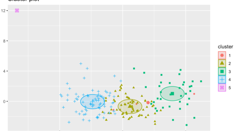
Actually creating the fancy K-Means cluster function is very similar to the basic. We will just scale the data, make 5 clusters (our optimal number), and set nstart to 100 for simplicity.
Here’s the code:
# Fancy kmeans
kmeans_fancy <- kmeans(scale(clean_data[,7:32]), 5, nstart = 100)# plot the clusters
fviz_cluster(kmeans_fancy, data = scale(clean_data[,7:32]), geom = c("point"),ellipse.type = "euclid")
Here’s the output:
This last plot really helps visualize that the clusters tend to actually be similar to each other. It is interesting how little code it takes to get some very interesting results.