Training a model while learning the basics of Machine Learning or Deep Learning is a very guided process. The dataset is well understood and adequately formatted for you to use. However, when you step in the real world and try to solve industry or real-life challenges, the dataset is usually messy if non-existent at the beginning. Understanding why your model isn’t straightforward. There are no concrete steps that lead you to the answers. However, certain tools to exist that allow you to investigate and gain deeper insights about your model outputs. Visualization is a very powerful tool and can provide invaluable information. In this post, I’ll be discussing two very powerful techniques that can help you visualise higher dimensional data in a lower-dimensional space to find trends and patterns, namely PCA and t-SNE. We will be taking a CNN based example and inject noise in the test dataset to do our visualization investigation.
I’ll briefly talk about the two techniques before diving into how to use them.
Principal Component Analysis (PCA) [1]
PCA is an exploratory tool used that is generally used to simplify a large and complex dataset into a smaller, more easily understandable dataset. It achieves this by doing an orthogonal linear transformation that transforms data into a new coordinate system arranged by their variance content in the form of principal components i.e. your higher dimensional correlated data is projected into a smaller space that has linearly independent bases. The first component has the maximum variance and the last component has the least. Your features that were correlated in the original space are represented in this newer subspace in terms of linearly independent or orthogonal basis vectors. [Note: The basis set B of a given vector space V contains vectors allow every vector in V to be uniquely represented as a linear combination of these vectors [2]. The mathematics of PCA is beyond the scope of this article.] You can use these components for a lot of things, but in this article, I’ll be using these components to visualize patterns in the feature vectors or embedding that we usually obtain from the penultimate layer of a neural network in a 2D/3D space.
t-distributed stochastic neighbour embedding (t-SNE) [2]
t-SNE is a powerful visualization technique that can help to find patterns in data in lower-dimensional spaces. It is a non-linear dimensionality reduction technique. However, unlike PCA it involves an iterative optimization which takes time to converge and there are a few parameters that can be tweaked. There are two major steps involved. First, t-SNE constructs a probability distribution over pairs of high-dimensional objects such that similar objects are assigned a higher probability and dissimilar objects are assigned lower probability. The similarity is calculated based one some distance such as Euclidean. Next, t-SNE defines similar probability distribution in a lower-dimensional space and minimises the Kullback-Leibler divergence (KL divergence) between the two distributions with respect to the locations of the points in the space. KL divergence is a statistical tool that allows you to measure the similarity between two distributions. It gives you the information lost when you use a distribution to approximate another. So if the KL divergence is minimised, we would have found a distribution that is a very good lower-dimensional approximation of the higher dimensional distribution of similar and dissimilar objects. This also means that the result would not be unique and you’ll get different results on every run. So it is a good idea to run the t-SNE algorithm multiple times before making your conclusion.
Next, I’ll talk about the classification dataset and architecture that we’ll be using in this article.
I want to use a real world dataset because I had used this technique in one of my recent projects at work, but I can’t use that dataset because of IP reasons. So we’ll use the famous MNIST dataset [4]. (Well even though it has become a toy dataset now, it is diverse enough to show the approach.)
It consists of 70,000 handwritten digit images in total. These are split into 60,000 training samples and 10,000 test samples. These are 28×28 grayscale images. Few random samples with corresponding labels are shown below.
I’ll be using a small CNN architecture for performing the classification and building it in PyTorch. The architecture is shown below:
It consists of a single conv2d layer with 16 filters and two linear layers that are the fully connected layers. The network outputs 10 values for every image. I’ve applied max pooling to reduce the feature dimensions. The network parameter summary is shown below.
We see that even this tiny network has 175k parameters. It is important to note here that the CNN layers have very few network parameters in comparison to the fully connected layers. These linear layers also introduce a restriction on the input size to the network because it was calculated for a 28×28 input and will change its dimensions for other input sizes. This is the reason why we can’t use pre-trained CNN models that have a fully connected layer for inputs that have a different size than the dimensions used during the training. I’ve applied relu activation after every layer except the last layer. Since the cross_entropy loss in PyTorch requires raw logits. It applies softmax internally. So please keep this in mind when using that particular function.
For training I use the Adam optimizer with default settings and the model was trained for 20 epochs and the best model kept based on the lowest validation loss. I observed the trend of overfitting as the training progressed by looking at the train and val metrics. I thought it might be a good idea to show it to you.
Throughout the training, we see that the training loss had a downward trend and the training accuracy has an upward trend. That means that our model complexity is adequate for our training dataset. For validation loss, we see a decrease till epoch seven (step 14k) and then the loss starts to increase. The validation accuracy saw an increase and then also starts to decrease towards the end. To read more about bias-variance trade-off, over-fitting and under-fitting, you can read this article: https://towardsdatascience.com/bias-variance-trade-off-7b4987dd9795?sk=38729126412b0dc94ca5d2a9494067b7
Now we’ll move on to the core of today’s article, visualization of feature vectors or embeddings.
I won’t be explaining the training code. So let’s start with the visualization. We will require a few libraries to be imported. I’m using PyTorch Lightning in my scripts, but the code will work for any PyTorch model.
We load the trained model, send it to the GPU and put it into eval mode. Putting your model in eval is very important because it will set the layers such as BatchNorm, Dropout etc. appropriately to behave properly during inference.
Next, we load our MNIST dataset and inject some noisy samples in the dataset.
The injected noise would look like this.
So we know that the model would have to spit some class but that would be garbage for these samples. This is one of the problems with using DL models, if you encounter out of distribution data, it would be very difficult to anticipate what the model would predict. And there is always the challenge of generalizing to unseen data. I’ve defined the model such that it returns the embedding tensor as well as the final prediction tensor. This allows easy access without having to alter the forward hooks in PyTorch.
However, if you do find yourself wanting access to the output of intermediate layers of pre-trained models you can use the following code to register forward hooks.
The prediction code for the MNIST dataset is as follows. We just loop over the dataset, do a forward pass through the network, extract the embeddings, and store those in an embedding tensor.
To do a sanity check, I plotted the output predictions for few sample input test points.
The model seems to be working as expected, the predicted label is shown at the top of every subplot. Finally, we can do the t-SNE and PCA projection to see some pretty visuals. I’m using the scikit-learn for these algorithms.
The resultant plot from the trained model embeddings is shown below. We see 11 pretty clusters as expected. The model predicted all the noise samples as eight. We see the purple cluster on the far right of the graph for these noise images. This is an anomaly and such anomalies or outliers should be investigated further in your real dataset investigations. You can use the x,y locations to get indices of the embeddings and map those to the image indices. That will show you what is wrong with those samples.
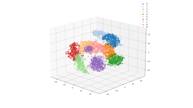
I also calculated 3D t-SNE projections, just to show that it is equally easy to do this.
We observe the same thing in the 3D projection as well.
For PCA the code is very similar but we use the PCA class instead of TSNE. I did both the 2d and 3d projections similar to t-SNE. However, there is one additional parameter that you need to keep in mind for PCA. This is the explained_variance_ratio_. This tells you the amount of variance from your data that the principal components capture. The higher these values the better your principal components will be able to show the variation in your data in the lower dimensional space. But lower values would indicate that only 2 or 3 components wouldn’t be very good at showing patterns.
For the first two principal components, only capture 25% of the variation in the embeddings. We do see patterns but the clusters aren’t as clear as the t-SNE embeddings. The outliers aren’t obvious from the PCA plot. The 3D plot shows the clusters a bit better though. This is because 3 components capture more variance. So the effectiveness of PCA visualization would depend on your data.
Before I conclude, I want to show you one more plot to make the power of t-SNE visualization clear. As an experiment, I calculated the embeddings using a model with random weights and plotted the t-SNE projections. To show you the clusters properly, I’ve colour coded these weights based on the actual labels available to us. We see that t-SNE gives us 11 clusters from embeddings extracted from an untrained model.
You must be careful though, t-SNE can produce some clusters which might be meaningless. Also to reiterate what I said in the introduction, these projections are not unique. So project it few times and verify that you get similar results in all of them.
We looked at t-SNE and PCA to visualize embeddings/feature vectors obtained from neural networks. These plots can show you outliers or anomalies in your data, that can be further investigated to understand why exactly such behaviour is happening. The computation time for these methods increases with more samples so just be cognizant of this. Thank you for reading and I hope you enjoyed reading this article. The code is available here: https://github.com/msminhas93/embeddings-visualization/blob/main/README.md
[1] https://en.wikipedia.org/wiki/Principal_component_analysis
[2] https://en.wikipedia.org/wiki/Basis_(linear_algebra)
[3] https://jakevdp.github.io/PythonDataScienceHandbook/05.09-principal-component-analysis.html