A practical guide for Tableau
Tableau is a powerful and efficient tool to create data visualizations. It allows for creating highly informative plots without writing any code. Besides, multiple visualizations can easily be combined into a dashboard.
Storytelling is a fundamental part of data scientists’ job and data visualization is a must for storytelling. Thus, data scientists are expected to have at least one data visualization tools or framework to have in their skillset. The versatility of Tableau makes it a highly popular data visualization tool in the data science ecosystem.
It takes practice to learn how to efficiently use Tableau. We can practice for free by downloading the public edition of Tableau Desktop which is available for Windows and Mac.
Tableau also provides Tableau Public which is a free platform to publicly share your dashboards. It is a great way to demonstrate your skills and creativity.
In this article, we will create a simple dashboard using the public edition. We will be using a dataset from Kaggle that contains the world happiness scores among some other measures for countries in 2019.
The first step is to add a connection to a data source. It is important to emphasize the word “connect” here because Tableau connects to the data file and uses it to create visualizations. It does not edit the original file.

We select the appropriate format and then navigate to the file where the dataset is saved.
Once Tableau is connected to the file, it provides an overview of the data source and automatically creates a worksheet.
The dataset contains 4 more measures in addition to the ones seen in the screenshot above. The additional measures are healthy life expectancy, freedom to make life choices, generosity, and perceptions of corruption.
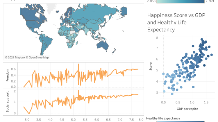
In Tableau, we use sheets to create visualizations. After the sheets are completed, we can combine them into a dashboard. The dashboard we will create in this article contains three visualizations:
- A world map colored based on happiness score of countries
- A scatter plot that demonstrates the relationship between GPD per capita, happiness score, and healthy life expectancy
- A line plot that demonstrates the relationship between freedom to make life choices, social support, and happiness score.