plt.bar(2018 + 0.00, data[‘below_450’][data[‘Date’].dt.year == 2018].sum(), color = ‘b’, width = 0.25, label= ‘below 450’)
plt.bar(2018 + 0.25, data[‘above_450’][data[‘Date’].dt.year == 2018].sum(), color = ‘g’, width = 0.25, label= ‘above 450’)
plt.bar(2018 + 0.50, data[‘total’][data[‘Date’].dt.year == 2018].sum(), color = ‘r’, width = 0.25, label= ‘total’)
plt.bar(2019 + .00, data[‘below_450’][data[‘Date’].dt.year == 2019].sum(), color = ‘b’, width = 0.25)
plt.bar(2019 + .25, data[‘above_450’][data[‘Date’].dt.year == 2019].sum(), color = ‘g’, width = 0.25)
plt.bar(2019 + .50, data[‘total’][data[‘Date’].dt.year == 2019].sum(), color = ‘r’, width = 0.25)
plt.bar(2020 + .00, data[‘below_450’][data[‘Date’].dt.year == 2020].sum(), color = ‘b’, width = 0.25)
plt.bar(2020 + .25, data[‘above_450’][data[‘Date’].dt.year == 2020].sum(), color = ‘g’, width = 0.25)
plt.bar(2020 + .50, data[‘total’][data[‘Date’].dt.year == 2020].sum(), color = ‘r’, width = 0.25)
plt.title(‘year wise distribution of number of candidates in each group’)
plt.ylabel(‘number of candidates’)
plt.xlabel(‘candidates in 2018, candidates in 2019, candidates in 2020’)
plt.legend()
plt.show()
Calculating the median scores for each year
PDF, CDF
Plotting PDF and CDF for in depth understanding of our score features
For below_450
For above_450
For Total
Let’s calculate the average and median score :-
1.Number of draws have declined in 2020, most probably because of covid-19 scare.
2.We can approximate the average frequecy of draws to 15 days.
3.Our assumption for score separator was correct for 450 as per business case study because the avg and median scores are both around 450.
4.Although the number of people have reduced in the pool but people who have scored more than 450 have increased at good pace.
5.This implies that this feature of above_450 is also one of the most crucial features because avg and median scores each year have increased just as above_450 feature.
6.Though statistically by calculating Corr() it is valued less than total and below_450 that is probably because of lesser numbers of draws in 2020, but we’ll keep this feature as important as others.
7.Almost all the values in all the features have had similar mean and median values, this implies that the data is well set and there are almost no outliers except a couple of values in CRS.
8.There’s a strong correlation between features and CRS score, also among the features themselves.
9.Few Statistics:-
1.CRS score goes approx. above 470 when number of ppl below_450 in pool are approx 120000
2.CRS score lies aprx. between 457 and 468 when ppl below_450 are between 105000 and 120000
3.CRS score lies below 460 if ppl below_450 are less than 100000
4.CRS score is above 470 if #ppl with 450_above score are more than aprx 10000
5.CRS score is between 457 and 468 when ppl above_450 are between 5000 and 10000
6.CRS score lies below 460 if ppl above_450 are less than 5000
7.CRS score is above 470 if total #ppl in pool are more than aprx 125000
8.CRS score is between 470 and 457 if total #ppl in pool are aprx between 105000 and 125000
9.CRS score is lower than 457 if total #ppl in pool are less than 105000
mean: below_450: 99598.17 below_450: 7769.09 total: 107367.25
Standard deviation: below_450: 15632.69 above_450: 8513.50 toal: 23264.110
10. Next, I’d like to see if by doing feature engineering such as the number of days between each draw and others can be of some value.
Leveraging time series, we are creating window features wherein we take the last 3 feature values average by calculating the window features i.e last 3 average values for below_450, above_450, total and CRS
Following is the code snippet that I had used to create these 4 additional window features:-
I calculated the average of last 3 values only because our dataset is small
This is how our data looks after adding 4 window features:-
Let’s see how our added features are statistically described:-
Observation:- The values in all three above features do not deviate much from original features as these are calculated from their means
Adding one more feature representing the gap between two consecutive draws as this will help in understanding the draws frequency and might be a very helpful feature:-
Analyzing days_gap feature
Observation: — As we can observe the outlier in the days_gap because of Covid-19 outbreak, let’s replace this by second highest value from the feature
Following is the code for doing the same:-
print(‘the second highest value for days gap is:’, data[‘days_gap’][data[‘days_gap’]< max(data[‘days_gap’])].max())
output-> the second highest value for days gap is: 28
Let/s replace 182 days by 28:-
data[‘days_gap’].replace(182 , 28, inplace=True)
Now this is our final data looks like before we move to scaling:-
Now at this point of time it is important to save our preprocessed data into a pickle file so that we do not have to re-run program every time.
# Data Checkpoint
DATA = data.copy()
import pickle
data.to_pickle(“./pro_data.pkl”)
Time based Splitting
Splitting data based on time as we need to predict new draws and testing should be done on the latest data. Below is the code snippet for train data and similarly we do it for X test data, y train and test data:-
Standard scaling
It is paramount for us to standardize our dataset as most of the regression models use Euclidian distances for their algorithms and we not want to jeopardize our values because of unscaled data. So first we create the scaler object and then we just fit on the train data and not on the test data to avoid data leakage problem and finally we save our trained model into the pickle file for future use.
First we scaler object:-
scaler = StandardScaler()
Following is the code snippet for fitting, transforming and saving the trained model in the pickle file and similarly we do it for the test dataset and for the Y train and test dataset. It is important to scale the target variable also as it helps in improving the accuracy.
Standardize features by removing the mean and scaling to unit variance
The standard score of a sample x is calculated as:
z = (x — u) / s
Minmax scaling
First we minmax object:-
minmax = MinMaxScaler()
Just like scaling we do mixmax to get the values in the range between 0 and 1.
The transformation is given by:
X_std = (X - X.min(axis=0)) / (X.max(axis=0) - X.min(axis=0))X_scaled = X_std * (max - min) + min
Similarly we do it for X_test, Y_train and Y_test datasets. Also, we save the trained model in the pickle file.
After scaling the dataset, let’s jump to one of the most important sections of the case study i.e modeling.
The process that I have used here for modeling is that:-
1. We create a random model for setting our worst performance bars
2. Then, we create our baseline model, in this case I have built a Linear Regression model as the loss function in this case is MSE which is also our KPI
3. Then we try and create multiple complex models such as Ensemble and Time series model(s) to minimize MSE and MAE.
4. Since our dataset is small we have an added advantage to experiments with multiple models to minimize the KPIs and at last comparing all the models’ performances.
Let’s begin:-
1. Creating a random model which just outputs the average value of the target feature i.e CRS:-
random_y = []
for row in range(X_train.shape[0]):
random_y.append(mean(Y_train[‘CRS’]))
Measuring Random Model performance through MSE:-
2. Creating our baseline model- Linear Regression Model(Ridge):-
We choose linear regression because
· Our dataset is small, Linear regression tends to work well with similar datasets
· Also, the loss function for Linear Regression is MSE which is also one of our KPI’s
But, first we need to hypertune the model with the help of GridSearchCV, Code:-
from sklearn.linear_model import Ridge
cv_mse= results[‘mean_test_score’]
train_mse= results[‘mean_train_score’]
alpha_values= results[‘param_alpha’]
plt.figure(figsize=(15,5))
plt.plot(alpha_values, cv_mse, label= ‘CV curve’)
plt.scatter(alpha_values, cv_mse, label= ‘CV mse points’)
plt.plot(alpha_values, train_mse, label= ‘train curve’)
plt.scatter(alpha_values, train_mse, label= ‘train mse points’)
plt.title(‘CV curve vs Train curve’)
plt.xlabel(‘Alphas’)
plt.ylabel(‘mse scores’)
plt.legend()
plt.show()
MSE Calculation for Linear Regression Model (Ridge)
# calculating mse for train and test data
print(‘Linear Regression Train MSE:’,mean_squared_error(Y_train, y_hat_tr))
output-> Linear Regression Train MSE: 0.009160673524770603
print(‘Linear Regression Test MSE:’, mean_squared_error(Y_test, y_hat_te))
output-> Linear Regression Train MSE: 0.009160673524770603
MAE Calculation for Ridge
print(‘Linear Regression Train MAE:’,mean_absolute_error(Y_train, y_hat_tr))
output-> Linear Regression Train MAE: 0.07946065494731351# calculating MAE for testfinal_lr_mae = mean_absolute_error(Y_test, y_hat_te)print('MAE for Test Linear Regression:', final_lr_mae)output-> MAE for Test Linear Regression: 0.10158228942325226To keep our blog a little short, I am going to skip few experiments with models that were good but not the best. To check out the full case study you can check out my GitHub profile which is mentioned at the end of the blog.3. GBDT (boosting)Before trying this, I also experimented with Decision Tree and Random Forest. The performances were good but GBDT just seems to do a little better.Following are the code snippets for the same:-from sklearn.ensemble import GradientBoostingRegressorscore_lst= []for m in range(32,257):gbdt = GradientBoostingRegressor(n_estimators= m, max_depth=2)gbdt.fit(X_train,Y_train)score_lst.append(gbdt.train_score_)# fetching the final training scorestrain_score=[]for i in score_lst:train_score.append(i[-1])
Calculatng MSE and MAE for GBDT
print(‘GBDT Train MSE:’,mean_squared_error(Y_train, gbdt_hat_tr))
print(‘GBDT Test MSE:’,mean_squared_error(Y_test, gbdt_hat_te))
print(‘*****************************************’)
print(‘GBDT Train MAE:’,mean_absolute_error(Y_train, gbdt_hat_tr))
print(‘GBDT Test MAE:’,mean_absolute_error(Y_test, gbdt_hat_te))
GBDT Train MSE: 1.4228967196440351e-05GBDT Test MSE: 0.003160014966977961*****************************************GBDT Train MAE: 0.0031675632474617876GBDT Test MAE: 0.03454233727873762
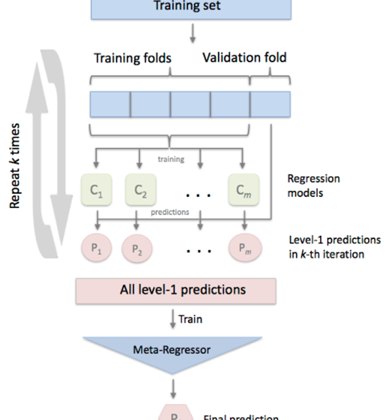
StackingCv Regressor
Out of all the models, StackingCV Regressor has given the best performance in terms of minimizing losses. I chose StackingCV Regssor over other models because it uses the concept of out-of-fold predictions: the dataset is split into k folds, and in k successive rounds, k-1 folds are used to fit the first level regressor. In each round, the first-level regressors are then applied to the remaining 1 subset that was not used for model fitting in each iteration. The resulting predictions are then stacked and provided — as input data — to the second-level regressor. After the training of the StackingCVRegressor, the first-level regressors are fit to the entire dataset for optimal predicitons.
Following is the code snippet in which I am going to use my already trained models in StackingCV Regressor:-reg1= Ridge()reg2= KNeighborsRegressor()reg3= DecisionTreeRegressor(max_depth=2)reg4= RandomForestRegressor(n_estimators= 41)reg5= GradientBoostingRegressor(n_estimators= 256, max_depth=2)#keeping linear regressor i.e Ridge as our meta regressor as linear models tend to do well as meta modelsstack = StackingCVRegressor(regressors=(reg1, reg2, reg3, reg4, reg5),meta_regressor=reg1)stack_fit = stack.fit(X_train.values.reshape(-1,8), Y_train.values.reshape(-1))stack_hat_te= stack_fit.predict(X_test)stack_hat_tr= stack_fit.predict(X_train)
Checking MSE and MAE for StackingCV Regressor:-
As we can observe above that train and test MSE have dropped to almost 0.001 which is a very good value for our model. Throughout this case study, I have tried various models which I have not mentioned here to keep blog a little shorter. I have tried time series models such as ARIMA and some custom models based on stacking give quite an interesting results. However, I would recommend you to check out the complete case study on my GitHub profile, which is explained in details and is kept quite simple to understand.
Following is the code snippet and results of all the models:-
Finally I am saving STacking RegressorCV model in pickle:-
model_file= ‘final_model.sav’
pickle.dump(stack_fit, open(model_file, ‘wb’))
Observation:- Intrestingly, our window features such as days_gap, crs_w are the top features, followed by above_450 feature
Conclusion:-
As per our observation from summary above StackingCv-Reg and GBDT models tend to out-perform others. In our case, StackingCv-Reg has better Test MSE and MAE values. It uses the best of all models.
References:-
http://rasbt.github.io/mlxtend/user_guide/regressor/StackingCVRegressor/
https://scikit-learn.org/stable/
https://www.appliedaicourse.com/
https://machinelearningmastery.com/arima-for-time-series-forecasting-with-python/
For my complete code, you may visit on :-
GitHub link:- https://github.com/TarunLohchab/CRS/blob/main/sc1_crs.ipynb
To connect with me :-
LinkedIn link:- https://www.linkedin.com/in/tarun-lohchab-3080b41bb/