Initialize a Flexdashboard from R Studio using File > New File > R markdown > From Template > Flex Dashboard, save, and knit the document.
This creates a static, two-column dashboard with one chart on the left and two on the right:
```1. Add runtime: shiny to the YAML header at the top of the document. This specifies that the Shiny package will be used to handle reactive content.2. Load the libraries flexdashboard, shiny, dplyr, and plotly.3. Add a new code chunk
{r data} where we will load and work with the data.4. Add sidebar attribute to the first column of the dashboard. The default width of the sidebar is 250 pixels; let’s change it to 200. Later, we will add user input controls to the sidebar.5. Slightly change the layout dimensions by making each column width equal to 400 pixels.```
If you did these steps your layout should look like below. Otherwise, you can copy-paste the following template.
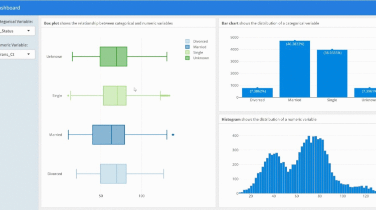
For this example, we will use a subset of the Credit Card Customers dataset from Kaggle to explore customer profiles with exploratory data analysis. Let’s load and prepare the data under the code chunk of the dashboard.
Remember to store both the dashboard and the data in the same working directory!
User inputs are the key components of a dynamic dashboard, driving functionality, user experience, and end results.
SelectInput widget creates a simple dropdown menu. In SelectInput widget we specify three arguments: (1) name: invisible to user, which we use to access widget’s value, (2) label: displayed above the dropdown menu, and (3) choices: list of values for the user to select.
We will create two SelectInput widgets in the dashboard’s sidebar, allowing the user to select a categorical variable and a numeric variable.
The dashboard should look like this when rendered:
Reactivity is what makes Shiny apps responsive, automatically updating whenever the user makes a change. To make an output reactive, we use Shiny’s render functions. Changes to inputs automatically render code and update outputs. Shiny offers a wide variety of render functions:
renderPlot - renders standard R plots
renderLeaflet — renders leaflet output
renderDT — renders DT DataTables
renderPlotly — renders plotly
In this project, we will create Plotly charts: (1) boxplot, (2) bar chart, and (3) histogram. We use renderPlotly to insert Plotly charts. The charts enclosed in the function renderPlotly will automatically update each time the user changes the corresponding input value.
1. The boxplot will react to a change in either widget.
2. The bar chart will react to a change in the categorical variable widget.
3. The histogram will react to a change in the numeric variable widget.
The code creates the app below:
You can find the final code here, and the finished dashboard is available at the following link.
In this post, we created your first interactive dashboard with flexdashboard and Shiny. Now you have the tools to creatively experiment and design your own dashboard. I hope you enjoyed the post. All suggestions and feedback are welcome and appreciated.
Thank you!