We will start by making a basic graph! There are several ways to do this. I found that the easiest way to do this was from a pandas DataFrame where you specify the edges. What’s an edge? Well, graphs are built using nodes and edges. A node represents some object, perhaps a person or organization, and an edge represents the actual connection from one node to another node. So in the example below, “A”, “B”, “C”, and “D” are nodes and the lines between them are the edges.
We can also change the color of all the nodes quite easily. You’ll notice a pattern that changing a feature globally for the graph is quite simple (using keywords in the .draw() method).
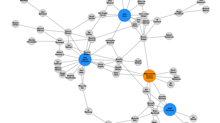
But let’s say that we want to change the color of nodes specifically by type, instead of globally. This takes a little setup, but once in place we can quickly add new types and automatically color accordingly. Basically, we create another DataFrame where we specify the node ID and node type and use the pd.Categorical() method to apply a colormap.
So now our letter nodes are colored blue and our number nodes are colored orange!
Altering node size globally is, again, quite simple via a keyword argument in the .draw() method — just specify node_size!
We can alter node size by type just like we can for color! I find this very useful for connecting people to organizations because organizations have many associated people so it makes sense to think of them as hubs with people as the spokes.
So we will build from our node color by type example, but instead of a single keyword argument for node_size we will pass in a list of node sizes referencing the node type used to choose node color.
Here’s the list comprehension logic if anyone is struggling —
For each node in the DataFrame, set the node size to 4000 if that node’s type is not “Letter”, otherwise set the node size to 1000. The result is that anything that’s not a letter will be a larger node. With only two node types at the moment this might be overkill, but it will scale better later.
node_sizes = [4000 if entry != 'Letter' else 1000 for entry in carac.type]
If we don’t need to change node size by type, but just want to draw attention to specific nodes, we can manual specify a list of sizes. These need to be in the same order as the nodes are stored, so call G.nodes() to generate a list to follow. Some representative sizes are labelled below so you can get a sense of their relative size. I find 5000 to be a good middle ground where a first and last name can fit comfortably.
Now that we’ve covered node attributes, we can move to edges. Setting a global edge size or color is as simple as for nodes, just specify the width keyword in the .draw() method.
Edges can be colored or sized individually instead of globally by passing in lists of attributes instead of single values. So below we have edge_colors and edge_widths which will be cycled through.
Finally, we can also add a colored border to the nodes with a confusingly named keyword “edgecolors”, which is not the same as “edge_color”. This can be used to help clarify and separate nodes, which you can see in the example graph below.
One of the most important aspects of a graph is how it’s laid out! This will ultimately determine the readability and usefulness of the graph. NetworkX has many options for determining the layout, of which I cover the most popular 4 below. The default is the spring_layout which is used in all above cases, but others have merit based on your use case. I recommend trying several to see what works best.