“Most of us need to listen to the music to understand how beautiful it is. But often that’s how we present statistics: we just show the notes, we don’t play the music.” — Hans Rosling
What is Data Visualization and Why we need Data Visualization?
- So, imagine you work in an organization as Analyst and you have made certain analysis. Now you need to show that to your teammates or some client. Now you can understand it by looking at the excel sheets or numbers but the other person is not an analyst, he is not from technical background. So, What you need to do? You need to present your analysis or data in such a way that the other person can understand and How you can do that? You can do that by representing in the form of graph.
Fact: Human brain can process information easily when it is in pictorial or graphical form.
2. Data Visualization allows us to quickly interpret the data and adjust different variables to see their effect.
Visualization gives you answers to questions you didn’t know you had.
Data Visualization is the presentation of data in a pictorial or graphical format. We do that in order to enable the decision makers of an organization to see the analytics presented visually so that they can grasp some difficult concepts or identify new patterns.
Use Cases:
- You can use it to identify the areas that need attention or improvement in your organization.
- You can use it in order to clarify which factors influence customer behaviour.
- You can use to check which product needs to place where, to whom you are selling and when as well.
- You can use it to predict Sales Volume as well
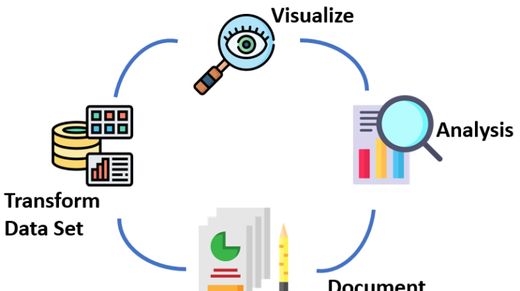
The process needs to follow:
It starts with
- Visualize: here you basically understand What your data is? You visualize it in a form of graph and understand What the data is actually talking about. Example: Suppose you have a dataset that tells you about the percentage of unemployed youth country wise from 2010–2014. Now, visualize it, the moment you visualize it, you get know, OK this country has a lot of unemployed youth, or Ok this country is doing pretty good. So, accordingly you just grasp it easily, when you visualize it.
- Analysis: After visualizing, you make certain Analysis.Now, suppose you want to find out the change in the percentage of unemployed youth between 2011-2010. That will cone into analysis phase.
- Document Insight: Now, you have done the analysis, but What is the outcome of that analysis? I see, the percentage of unemployed youth, Which country has gone up?, Which country has maximum number? and many more. We’ll see that and make a document. That comes under Document Insight, what we observed we we’ll document it.
- Transform Data Set: Now, there may be certain field in my data that I don’t need, At that time, What I’ll do, I transform my dataset, I’ll remove all these fields, and there might be some field which I need, and not there, I’ll add them to my dataset. So, I accordingly transform my dataset, and once I’ve done that I again Visualize my data to understand What my data is now talking about.
And this process will keep on repeating.
Thanks for giving your valuable time.