What is ML model explainability?
With exception of simple linear models like linear regression where you can easily look at the feature coefficients, machine learning models can often be a bit of a blackbox. It can be very difficult to understand why the model predicts a particular output, or to verify that the output makes intuitive sense. Model explainability is the practice that attempts to address this by
- Disaggregating and quantifying the key drivers of the model output
- Providing users tools to intuitively reason about why and how the model inputs lead to the output, both in the aggregate and in specific instances
Why is it important to explain your ML models?
Humans tend to distrust that which we cannot understand. The inability to understand the model often leads to a lack of trust and adoption, resulting in potentially useful models sitting on the side lines. Even if the stakeholders and operators get over the initial hurdle of distrust, it is often not obvious how to operationalize the model output. Take a churn prediction model for example, the model may be able to tell you that a particular customer is 90% likely to churn, but without a clear understanding of the drivers, it’s not necessarily clear what can be done to prevent churn from happening.
Of course, the magnitude of the hurdles depend on the specific use case. For certain classes of models like image recognition models (often deep learning based), it is very apparent if the output is right or wrong, and it is also fairly clear how to use the output. However, in many other use cases (like churn prediction, demand forecasting, credit underwriting, just to name a few), the lack of explainability poses significant obstacles between models and tangible impact. The most accurate model in the world is worthless if it is not being used to drive decisions and actions. Therefore it is crucial to make model as transparent and understandable to the stakeholders and operators, so that it can be leveraged and acted upon appropriately.
How do I explain ML models?
There are quite a few different approaches (some of which are model type specific) to help explain ML models. Of these, I like SHAP the most, for a few different reasons
- SHAP is consistent, meaning it provides an exact decomposition of the impact each driver that can be summed to obtain the final prediction
- SHAP unifies 6 different approaches (including LIME and DeepLIFT) [2] to provide a unified interface for explaining all kinds of different models. Specifically, it has
TreeExplainerfor tree based (including ensemble) models,DeepExplainerfor deep learning models,GradientExplainerfor internal layers to deep learning models,LinearExplainerfor linear models, and a model agnosticKernelExplainer - SHAP provides helpful visualizations to aid in the understanding and explanation of models
I won’t go into the details of how SHAP works underneath the hood, except to say that it leverages game theory concepts to optimally allocates the marginal contribution for each input feature. For more details, I encourage the readers to check out the related publications.
I will instead focus on a hands on example of how to use SHAP to understand a churn prediction model. The dataset used in this example can be obtained from Kaggle.
Model setup
Since the model is not the main focus of this walk through, I won’t delve too much into the details, except to provide some quicks notes for the sake of clarity
- Each row in the dataset is a telco subscriber and contain metadata about the location, tenure, usage metrics, as well as a label of whether the subscriber has churned
- Before model training, the dataset is pre-processed to convert boolean features into 1 and 0, categorical features into one-hot encoded dummies, and numerical features into Z-scores using the sklearn
StandardScaler(remove mean and normalize by standard deviation) - Minutes and charges features are found to be perfectly co-linear, so the minutes features are removed
- The sklearn
GradientBoostingClassifieris used to model the churn probability andGridSearchCVis used to optimized the hyper-parameters - The resulting model has a 96% accuracy in cross-validation
The code that performs the above is as follows
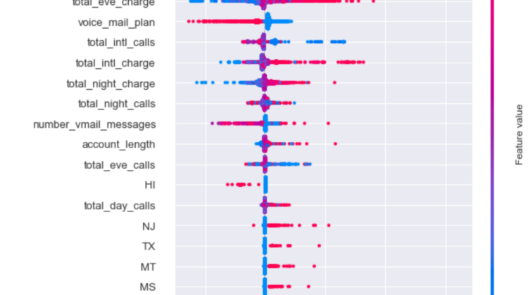
Explaining aggregate feature impact with SHAP summary_plot
While SHAP can be used to explain any model, it offers an optimized method for tree ensemble models (which GradientBoostingClassifier is) in TreeExplainer. With a couple of lines of code, you can quickly visualize the aggregate feature impact on the model output as follows
explainer = shap.TreeExplainer(gbt)
shap_values = explainer.shap_values(processed_df[features])shap.summary_plot(shap_values, processed_df[features])
This chart contains a ton of information about the model at the aggregate level, but it may be a bit overwhelming for the uninitiated, so let me walk through what we are looking at
- The individual dots represent specific training examples.
- The y-axis are the input features ranked by magnitude of aggregate impact on the model output. The colors of the dots represent the value of the feature on the y-axis. Note that this does not mean the top feature is total_day_charge for every subscriber, we will get to explaining individual examples.
- The x-axis are the SHAP values, which as the chart indicates, are the impacts on the model output. These are the values that you would sum to get the final model output for any specific example. In this particularly case, since we are working with a classifier, they correspond to the log-odds ratio. A 0 means no marginal impact to the probability, positive value means increases to the churn probability, and negative value means decreases to the churn probability. The exact relationship between overall odds-ratio and probability is log(p/(1-p)), where p is the probability.
- SHAP adds a bit of perturbation to the vertical positions of points when there is a large number of points occupying the same space to help convey the high density. See the large bulb of points for
total_day_charge
What we can we learn from this plot
- Similar to what you can get from traditional feature importance plots from classifiers, we can see that the top 5 drivers of churn are
total_day_charge,number_customer_service_calls,international_plan,total_eve_charge, andvoice_mail_plan - We can see how each of the feature impact churn probability —
total_day_chargeimpact is asymmetrical and primarily drives up churn probability its value is high, but does not drive down churn probability to the same extent when its value is low. Contrast this withtotal_eve_chargewhich has a much more symmetrical impact. - We can also see that subscribers who have
international_planare much more likely to churn than those who do not (red dots are far out on the right and blues dots are close to 0). Conversely, those who havevoice_mail_planare much less likely to churn than those do not.
Explaining specific feature impact with SHAP dependence_plot
The impact of international_plan is very curious: why would subscribers who have it be more likely to churn than those who do not? SHAP has nice method called dependence_plot to help users unpack this.
shap.dependence_plot("international_plan", shap_values, processed_df[features], interaction_index="total_intl_charge")
The dependence plot is a deep dive into a specific feature to understand how the model output is impacted by different values of the feature, and how this is impacted by interaction with other features. Again, it can be a bit overwhelming for the uninitiated, so let me walk through it
- Dots represent individual training examples
- Colors represent value of the interaction feature (
total_intl_charge) - y-axis is the SHAP value for the main feature being examined (
international_plan) - x-axis is the value of the main feature being examined (
international_plan, 0 for does not have plan, 1 for have plan)
We can see, as before, those with international plan seems to have higher churn probability. Additionally, we can also see from the interaction feature of total international charge, that the red dots (higher total international charge) tends to have higher churn probability. Because of the bunching of points, it is difficult to make out what is happening, so let’s change the order of the two features to get a better look.
shap.dependence_plot("total_intl_charge", shap_values, processed_df[features], interaction_index="international_plan")
Now this plot tells a very interesting story.
As a reminder, the x-axis here is total international charge transformed to the z-score, 0 = the average of all subscribers in the data, non-zero values = standard deviations away from the average value. We can see that for those who have international charge less than 1 standard deviation above the average, having an international plan actually lowers churn impact of international charge (red dots to the left of 1 have lower SHAP value than blue dots). However, as soon as you cross to the right of 1 standard deviation of international charge, having international plan actually significantly increases the churn impact (red dots to the right of 1 have much higher SHAP value than blue dots)
It is not that people who have international plan are more likely churn, rather it is that people who have international plan and also high total international charge are a LOT more likely to churn.
A plausible way to interpret this is that subscribers who have international plans expect to protected from high international charges, and when they are not, they are much more likely to cancel their subscription and go with a different provider who can offer better rates. This obviously requires additional investigation and perhaps also data collection to validate, but it is already a very interesting and actionable lead that can be pursued.
Explaining individual examples with SHAP waterfall_plot
In addition to understanding drivers at an aggregate level, SHAP also enables you to examine individual examples and understand the drivers of the final prediction.
# visualize the first prediction's explanation using waterfall
# 2020-12-28 there is a bug in the current implementation of the waterfall_plot, where the data structured expected does not match the api output, hence the need for a custom classi=1001class ShapObject:def __init__(self, base_values, data, values, feature_names):
self.base_values = base_values # Single value
self.data = data # Raw feature values for 1 row of data
self.values = values # SHAP values for the same row of data
self.feature_names = feature_names # Column namesshap_object = ShapObject(base_values = explainer.expected_value[0],
shap.waterfall_plot(shap_object)
values = shap_values[i,:],
feature_names = features,
data = processed_df[features].iloc[i,:])
This plot decomposes the drivers of a specific prediction.
- the x-axis is the SHAP value (or log-odds ratio). At the very bottom E[f(x)] = -2.84 indicates the baseline log-odds ratio of churn for the population, which translates to a 5.5% churn probability using the formula provided above.
- the y-axis is the name of features being represented by the arrows, along with their respective values.
- The impact (SHAP value) of each individual feature (less significant features are lumped together) is represented by the arrows that move the log-odds ratio to the left and right, starting from the baseline value. Red arrows increase the log-odds ratio, and blue arrows reduce the log-odds ratio
This particular example has a final predicted log-odds ratio of -3.967 (or 1.8% churn probability) largely driven by relatively average total day charge, and the low number of customer service calls. Contrast this with the example below, where the final predicted log-odds ratio is 1.667 (or 84% churn probability), and is largely primarily by the very high number of customer service calls.
- ML model explainability creates the ability for users to understand and quantify the drivers of the model predictions, both in the aggregate and for specific examples
- Explainability is a key component to getting models adopted and operationalized in an actionable way
- SHAP is a useful tool for quickly enabling model explainability
Hope this was a useful walk through. Feel free to reach out if you have comments or questions.
Reference
[2] https://github.com/slundberg/shap#methods-unified-by-shap