In this blog, we would see how to visualize our data with use of matplolib and seaborn libraries.
First we would learn about matplotlib library.
Introduction:
It’s a massive visualization library in Python used to create a plot of a dataset in 2-D or 3-D. Its base library is NumPy and is designed to work with the broader SciPy stack.
Setting the environment:
There are two methods to install matplotlib–
1. By installing anaconda: this package comes pre-installed in the anaconda distribution for python.
2. By using pip command: In command prompt, just type in “pip install matplotlib”.
Getting started with matplotlib:
Like any package, we need to first import matplotlib. If you are working in Jupyter notebook, enabling the interactive mode for matplotlib would add on to the convenience. The interactive mode advantages:
- This mode enables us to plot different types of graphs
- zoom in graphs to view details
- save graphs for later use.
- Updates our plots after every statement
Enable inline backend in Jupyter. This way you won’t need to write plt.show() every time you want to display your plots.
How to import: simply type in,
import matplotlib.pyplot as plt
To enable interactive mode and enabling inline backend in Jupyter notebook:
%matplotlib notebook
Creating Graphs:
plt.scatter(x,y,c=’<color>’): It plots each point in the dataset in the form of dots. The position of the dot gives the information regarding relationship between variables. Its arguments are:
- x and y: both can be either float value or an array
- c: for specifying color of the dots. c can have values like ‘r’ for red, ‘g’ for green and ‘b’ for blue.
plt.xlabel(<label>) and plt.ylabel(<label>): enables us to give a label to the x and y axis respectively.
plt.title(<string>): we can give title to a graph using this.
plt.savefig(<Name_file>): you could save the graph in image format.
Code Snippet for graph below:
Using plt.plot(x, y, <format_string>):
The arguments of the given function are-
- x and y: these are the interval markings on the horizontal and vertical axis.
- fmt or format string: this can include the symbol for the colours and the style in which the lines in the plot can appear. If the colour symbol is not mentioned, then by default the graph would have a blue colour line. For example, in the diagram given below, we have used style format as, ‘r-*’, which means the red line would appear as a continuous line and the points on this line will be marked as ‘*’.
If we had used ‘r- -*’ then we would get the 2nd image and if format string were ‘ro’ then we would get 3rd image.
All of the syntax formats given below give us the same result (first figure):
- plt.plot(x,y,’r*’,linestyle=’-’,markersize=10)
- plt.plot(x,y,’r*’,ls=’-’,markersize=10)
- plt.plot(x,y,’r-*’,markersize=10)
Creating Subplots:
plt.subplots(nr, nc, index) helps us create multiple plots on a single canvas. It has mainly three arguments-
- nr: number of rows
- nc: number of columns
- index: it gives the index position of each subplot. For example, if nr=2, nc=2 and index=3 we would have a subplot at position, 2nd row and 1st column of the canvas.
The canvas (where our graphs are displayed) is divided into nr rows and nc columns. So, for the code snippet given below we get:
Creating Bar Graphs:
We use plt.bar(x, height, width, align, color) where,
- x: these are x coordinates of our dataset (sequence of scalars)
- height: gives height for each individual bar (sequence of scalars)
- width: gives width of each bar; the default value is 0.8
- align: the values can be either ‘center’ or ‘edge’ (default: ‘center’).
- color: assign colour to the bars (optional)
Code Snippet for graph below:
To create bar graph with gridlines we use:
plt.grid(b, which, axis, color, linestyle) where,
- b: it’s a Boolean value. If you want grid lines then assign True (optional)
- which: states which grid lines to customize. It can have ‘major’, ’minor’ or ‘both’ options. (optional)
- axis: states along which axis the grid lines should be applied i.e., do we need horizontal or vertical gridlines or at both axes. Acceptable values include (‘x’, ‘y’ and ‘both’).
- color: to assign a colour to the grid lines (optional)
- linestyle: to stylize gridlines. For example, it can have values like, — , — — etc.
Code snippet:
We can also create horizontal bar graphs using plt.barh(x, height):
(Note: Seaborn have much better bar plots then those formed from matplotlib)
Creating Histograms:
We use plt.hist(x, bins) where,
- x: sequence of scalar values (it could either be a single array or a sequence of arrays)
- bins: it is either an integer or a sequence of integers. It specifies consecutive, non-overlapping intervals for that variable. Its default value is 10.
Code Snippet to create the plot below:
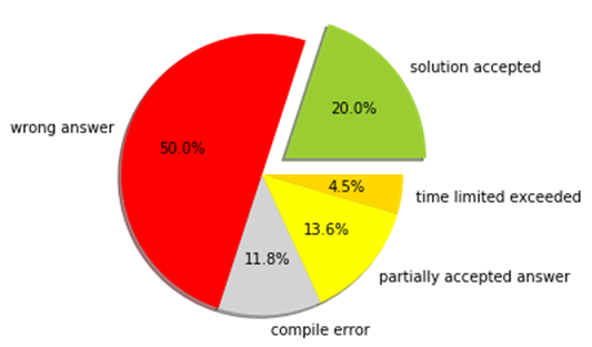
Creating Pie Chart:
We can do so using, plt.pie(x, explode , labels , colors , autopct , shadow) where,
- x: array or list of wedge sizes
- explode: sequence of numbers which provide the degree with which a sector gets separated from our pie chart.
- labels: it is an optional list of strings which gives labels for each wedge.
- colors: list of colors accepted by matplotlib
- autopct: It is a format string which is applied to all our wedge labels (optional)
- shadow: to give a shadow effect to the pie chart, assign True to this parameter.
Code Snippet to create the plot below:
Creating Box Plot:
Box Plot gives us the minimum, 25th, 50th, 75th and the maximum percentile in our dataset.
We can create this using plt.boxplot( x , vert , patch_artist ) where,
- x: it is the array of vectors
- vert: it is a bool value; if you want vertical box plot then assign it with True
- patch_artist: if false, then the box is made with Line2D artist else, it is made with Patch artist.
Interpretation of Box Plot
- The bottommost line outside the box gives us the minimum percentile.
- The bottommost edge of our box gives 25th percentile.
- Middle line in the box gives us the median value or 50th percentile.
- The uppermost edge gives us 75th percentile
- The uppermost line outside the box gives us 100th percentile.
Code Snippet to create the plot below:
Visualizing and analyzing univariate and bivariate problems are fairly easy. But the real problem in analysis comes when we have more than 2 features for every input in our dataset. This is where seaborn comes to the rescue.
Seaborn is a visualization library which is based off of our matplotlib library. It provides high-level interface for creating informative statistical graphs combined with aesthetic features.
Setting the environment:
Again, we have two methods-
- Using pip command in command prompt. Just type in the following and it will get installed
pip install seaborn
- Or, just install good old Anaconda distribution and you are good to go.
We have different types of Distribution Plots in Seaborn:
- distplot
- joinplot ( particularly useful for bivariate analysis)
- pairplot (useful for datasets containing 3 or more than 3 features)
These distributions are for continuous features.
To import Seaborn:
import seaborn as sns
Today, we will be learning through the use of a dataset called “tips” . Like “tips”, there are a lot of inbuilt datasets in Seaborn. This can be accessed with the use of sns.load_dataset(<name_of_dataset>).
A little bit about “tips” dataset…
- It consists of data regarding the customers who gave a tip in a resturant
- The dataset has information like, total_bill , tip, sex, smoker (whether the customer smokes or not), day ( the day in which the observation is made), time ( for example lunch, when the tip was given), size ( size of the group when they had their meal).
Since we want to find the tip from our input, tip becomes an output/ dependent variable while the rest of the features would come under our independent variables.
Before, we introduce this topic, we need to have some basic idea of what correlation is.
Correlation:
It is a statistical measure used to define the relationship between two variables. It is numerically defined by the correlation coefficient whose value lies between -1 and +1. If the correlation is positive, it suggests that the two variables go in the same direction. If one variable’s value increases so, does the others.
If correlation coefficient =+1 , then it is known as perfect correlation. This suggests that the two entities go in the same direction and by the exact same percentage.
Similarly, a negative correlation means that two entities go in opposite directions and zero correlation means that there is no relationship between them.
Coming back to heatmap…
Heatmap is a feature in seaborn which helps us find the correlation between the features. One thing of importance is that correlation can only be found out between variables whose data type is either a float or integer. It is not applicable to the categorical data types (them being of object type instead of scalar values).
From the image of the heatmap and correlations, we can see the following relationship:
- As our total_bill increases, so does our tip.
- As the size of the group having meal increases, so does our tip. But the amount of increase in tip with size is less compared to when our total_bill is increasing. This is also suggested by the lower correlation value between size and tip compared to total_bill and tip.
- In heatmap, the more darker the color, the lesser is the correlation.
JointPlot
It is used to analyze the relationship between two variables. Here, we would applying on the features: “tip” and “size”.
Code snippet:
where,
- x and y: are the features whose relationship we want to analyze
- data: for passing the dataset
- kind: Defines the kind of graph to plot. It can have values ‘hex’ or ‘reg’. In case of ‘hex’, if plots the points on the graph in the form of hexagons. In case of ‘reg’, it stands for regression. It plots a regression line and gives a probability distribution of our dataset.
Pair Plot or Scatter Plot:
It is useful for datasets with more than 2 independent features. It plots the graph between two variables for every possible combination of our features. The feature again must be an integer or float value.
In scatter plot, we can classify the point based on a feature of the dataset. We can do all this using:
sns.pairplot(df,hue='sex') where,
df is our dataset and hueis assigned with the feature through which we want to classify the plots. With classification our pair plot looks like this:
Distplot:
It is used to plot a histogram and we can plot a kde or probability distribution curve in the same graph.
sns.distplot(df['tip'],kde=True,bins=10) where,
first argument is the integral or float data type feature whose histogram or kde we want to plot.
kde(kernal density estimation): its a bool value; if true it plots the probability distribution for the first argument and the values in vertical axis become in the range of (0,1). Default value is True.
bins: similar to that in plt.hist( ), we can set the no. of continuous non-overlapping intervals.
countplot(): It shows the distribution of categorical features using bar graphs.
sns.countplot('<categorical_feature>',data=df) where,
- first argument is the categorical feature we want to have a plot of. If we pass it as a y value then, we would have a horizontal bar graph. The default way in which it is passed is as an x value.
- data: refers to our dataset
boxplot( ):
sns.boxplot(x=<feature>,y=<feature>,data=<data_set>,hue=<feature>,orient=<v|h>) where,
- first argument is shown on x-axis (optional)
- second argument is shown on y-axis(optional)
- data: dataset to be plotted
- hue: feature to be classified. Based on this we would obtain data on different groups. For example: we can display data for smokers or non-smokers.
- orient: want the plot to be horizontal or vertical (optional)
Violin Plot:
Combines boxplot and kde distribution. Its syntax can be given as follows:
sns.violinplot(x='<value'>,y='<value'>,data=<dataset>,palette=<'color_scheme'>)
Looking closely in our graph we see that in the middle of the kde distribution, we have a boxplot graph as well.
Needless to say, it is a huge topic and would definitely recommend reading documentation and trying your hand on these functions. This is a blog to get a basic idea of what matplotlib and seaborn library functions do.
That’s all for today, thank you very much for reading this blog!!