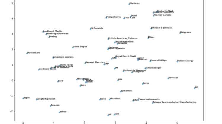
The complete algorithm looks like this:
import numpy as np
import matplotlib.pyplot as plt
import pandas as pd
from sklearn.preprocessing import normalize
from sklearn.manifold import TSNEstocks = pd.read_csv('company-stock-movements-2010-2015-incl.csv', index_col = 0)
movements = stocks.values
companies = stocks.indexnormalized_movements = normalize(movements)model = TSNE(learning_rate = 50)tsne_features = model.fit_transform(normalized_movements)xs = tsne_features[:,0]
ys = tsne_features[:,1]fig, ax = plt.subplots(figsize = [15, 10])
plt.scatter(xs, ys, alpha = 0.5)for x, y, company in zip(xs, ys, companies):
plt.annotate(company, (x, y), fontsize=9, alpha=0.75)plt.tight_layout
plt.show()
Notice how the algorithm is able to group companies from similar sectors:
While also not generating exclusively sector or industry-based clusters:
The presented algorithm is design to group companies based on its stock price movements and visualize said grouping. It can potentially allow people without knowledge of all the sectors to understand which companies belong to the same type of business or it can also allow professionals to understand which companies move very similarly and which don’t independently on whether they belong to the same sector or not. Lastly, it can be used manually or in conjunction with other algorithms to anticipate movements on stock prices based on data or news related to one of the companies that are close to this one in the visualization.
