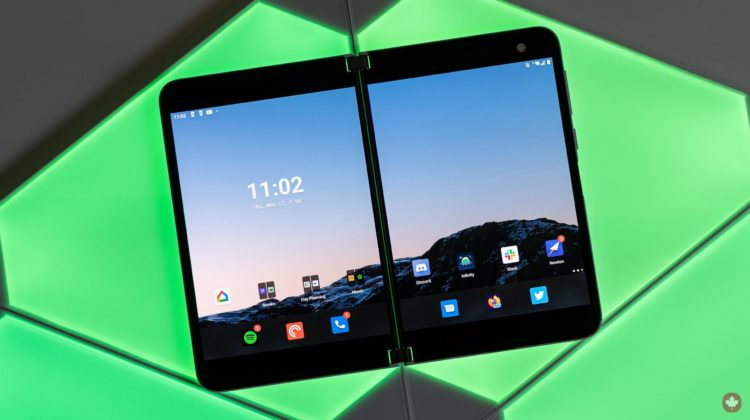
Microsoft’s Surface Duo has finally made the journey to Canada. The expensive, somewhat weird dual-screen Android smartphone-tablet is now available for a whopping $1,869.
If you paid attention to any of the Duo reviews coming out of the United States when the phone first launched last year, you’re likely here expecting a similar analysis: buggy software, terrible camera and complaints about the high price tag. Well, some of what U.S. reviewers said still holds true. However, Microsoft has improved the experience through software updates. To be clear, the Duo isn’t perfect, but in my time with the phone, it also surprised me with how well it all comes together.
Still, software updates alone won’t fix some of the Duo’s more glaring issues, like a lack of 5G connectivity (not that it’ll matter in Canada for at least a few more years), dated hardware and poor camera quality. For many people, the Duo’s specs alone will rule it out as an option. And yet, when you use it, the specs hardly matter — the Duo comes very close to “just working.”
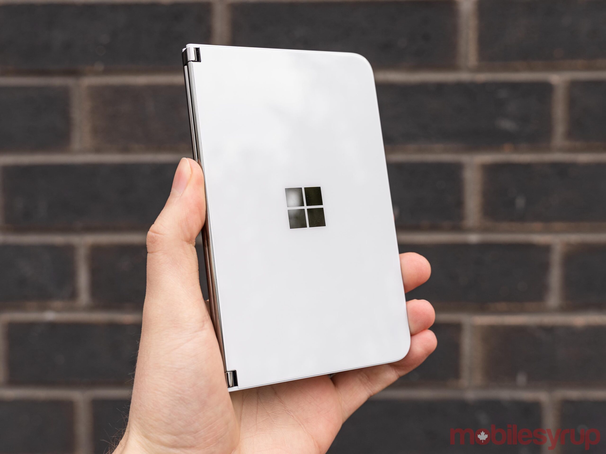
Ultimately, I think the biggest obstacle between most customers and the Surface Duo will be the price. Beyond that, the Duo provides an excellent experience for people who want what it offers. For those who don’t, that’s fine — you don’t need to own one to appreciate what Microsoft is trying to do.
While the hardware is undoubtedly unique, I feel the software is the more pressing thing to address with the Duo. So much of Microsoft’s goals with the Duo come down to making two apps on two screens work — nearly every design, hardware and software decision pushes to that goal. That makes it hard to talk about, say, the lacklustre processor without acknowledging why Microsoft chose it, or how through software optimizations, Microsoft managed to offer excellent performance with it.
Specs
The Duo shines when using both screens
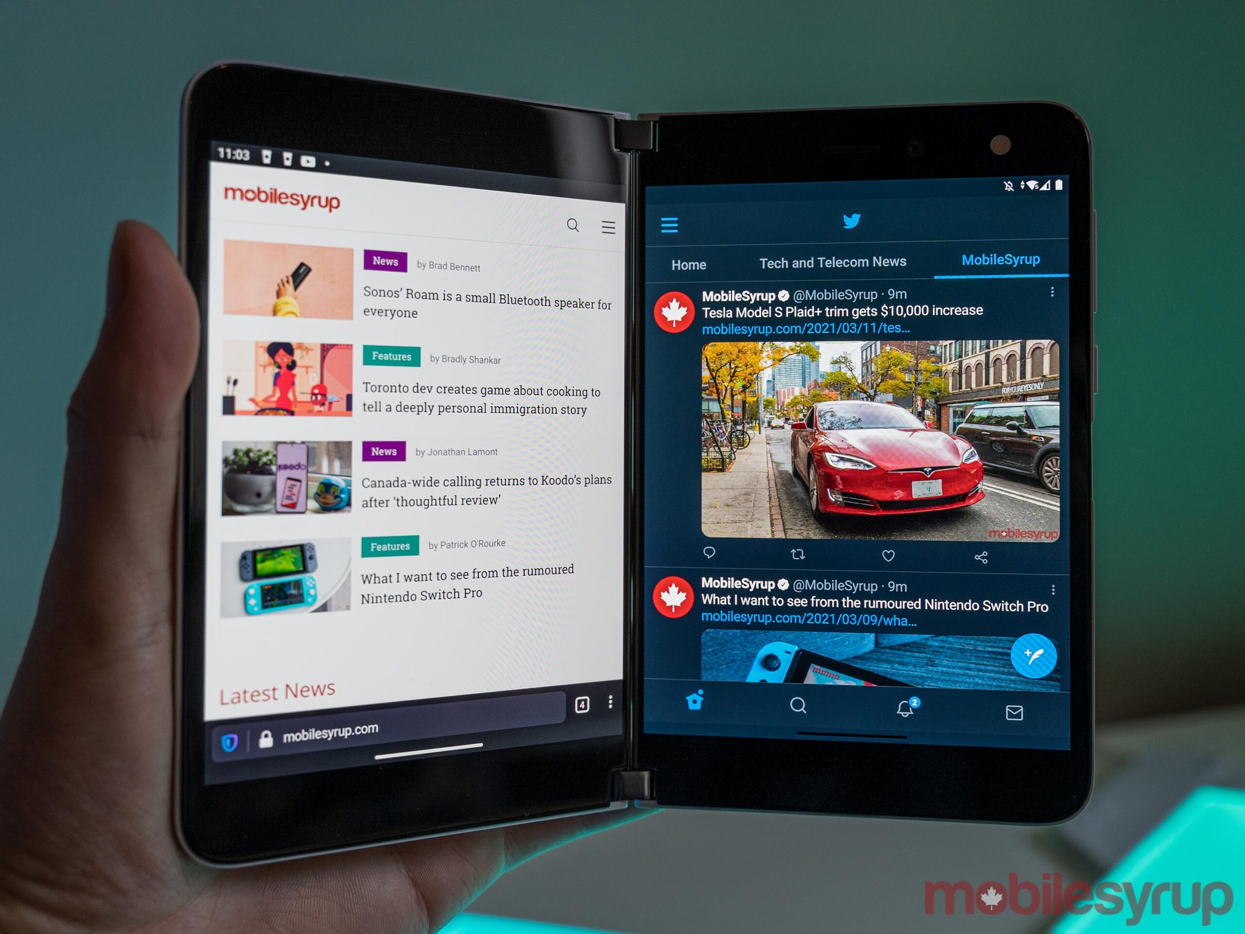
The Duo is at its best with an app on each screen.
Everything I read about the Surface Duo when it launched back in 2020 prepared me for a disappointing product. However, using it has been anything but. To start, the Duo helped me realize that the device isn’t for me, and that’s okay.
Microsoft designed the Duo around running two apps at the same time. Pete Kyriacou, Microsoft’s vice president of devices, made this abundantly clear when I spoke to him about the Surface Duo.
“We saw more and more people doing [complex tasks] on a mobile device, but doing it with limited form factors. And we thought, what would we do as Microsoft from a productivity standpoint, to help people get more done,” Kyriacou said.
“It’s not productivity, so you can cram more into your day… [It’s] about lowering the cognitive load that it takes when you get an email [meeting invite,] to open the email and then open your calendar next to it without having to switch back and forth and remember it all but see things contextually side-by-side.”
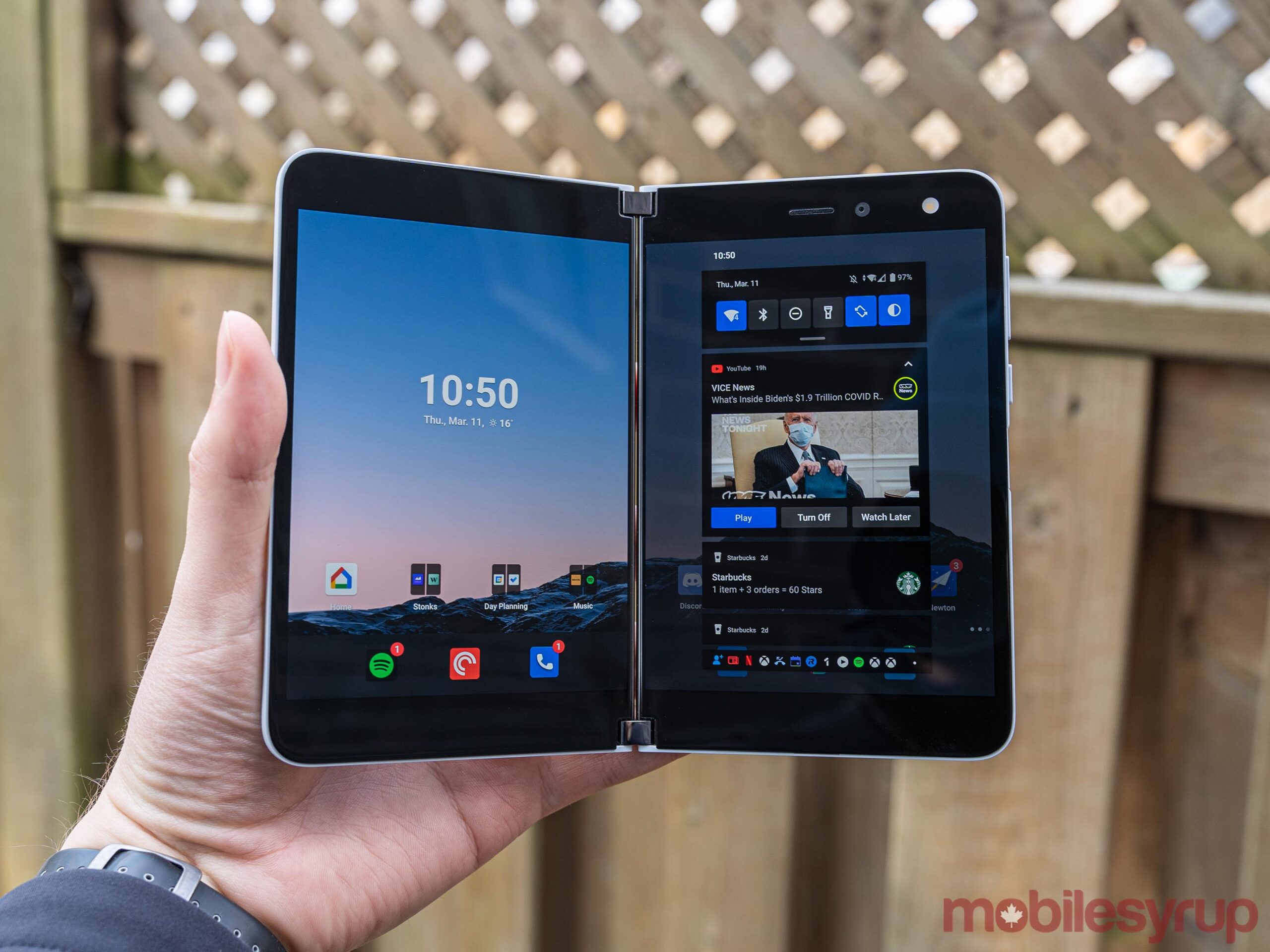
Microsoft kept visual tweaks minimal to focus on the dual-screen experience
The core principle of running two apps side-by-side is the foundational Surface Duo experience — it’s where the device shines despite its flaws. And trust me, the first time you do this, it feels genuinely revolutionary.
For me, that fell apart when I realized I often don’t use my phone that way. Sure, there are times where I need to check two apps at the same time, but I found those instances were rare. In using the Duo, I often sought out reasons to run multiple apps to feel like I was using the second screen. More often than not, I only ran one app because I only needed one app.
If you’re thinking about buying a Surface Duo, I think the main question to ask is whether you need two screens to get things done on your phone. If the answer is yes, you’ll probably love using the Duo, regardless of its other issues.
Betting on two
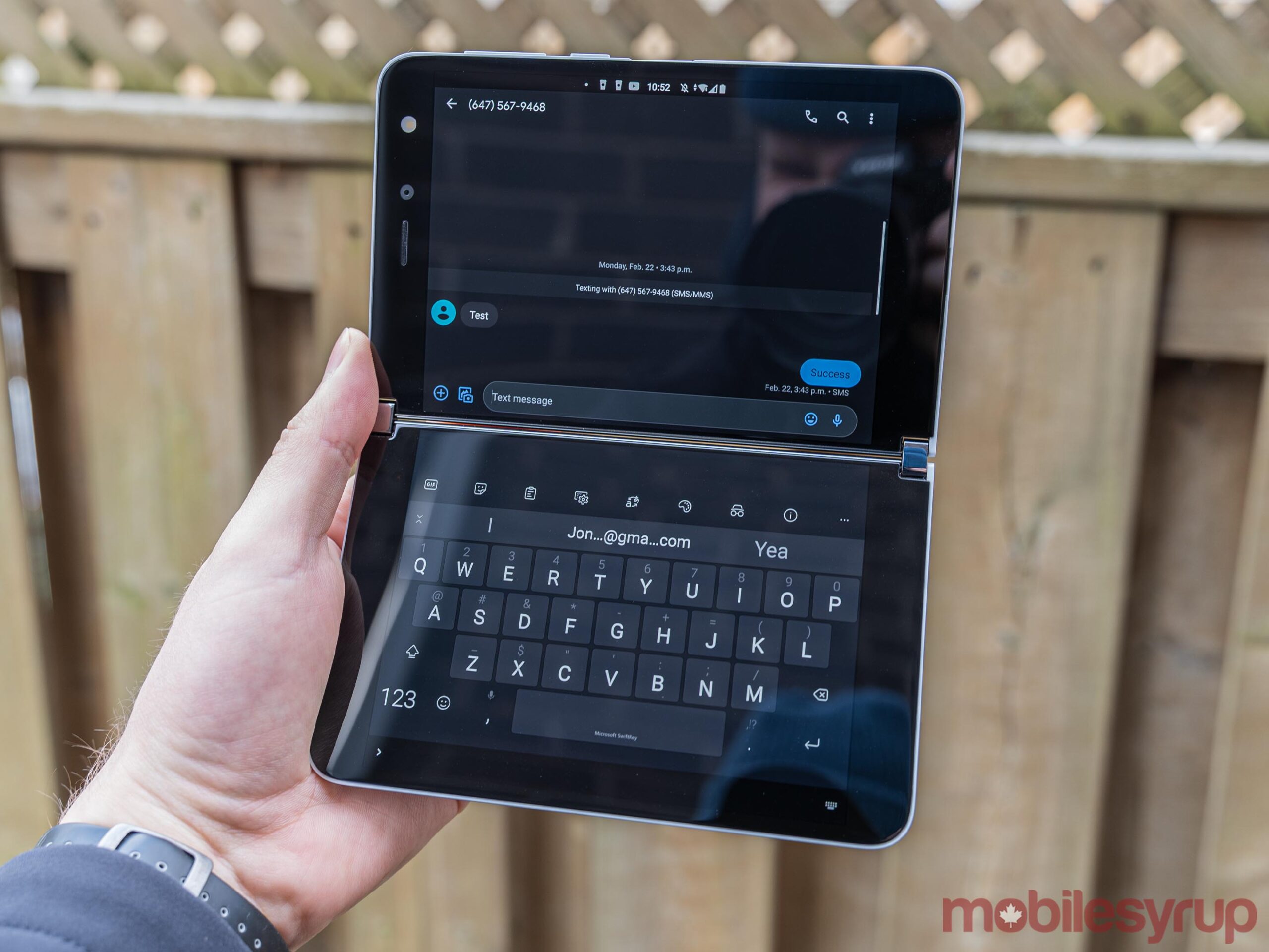
You can trace most perceived flaws with the Surface Duo back to Microsoft’s primary goal of a two-screen experience. The company’s desire to achieve that contributed to every design decision and concession it made.
Starting at the very top, some people might wonder why Microsoft chose to use two different displays on the Duo instead of one folding panel like Samsung did with its Galaxy Z Fold 2. Kyriacou links it back to the “windowing” experience in Windows 10 — that snap feature where you can quickly open two windows side-by-side. He explains that people have built up a multi-window or multi-monitor muscle memory with increased remote work during the pandemic and video conferencing
So, Microsoft took a similar approach when it came to building out the Duo experience on Android. Instead of working on a heavily tweaked or modified Android skin like other manufacturers, Microsoft kept an almost Pixel-like simplicity. The company focused on adapting Android’s multitasking and windowing systems to feel similar to what you’d get on a Windows PC — apps, or ‘windows,’ snap to one of the two screens.
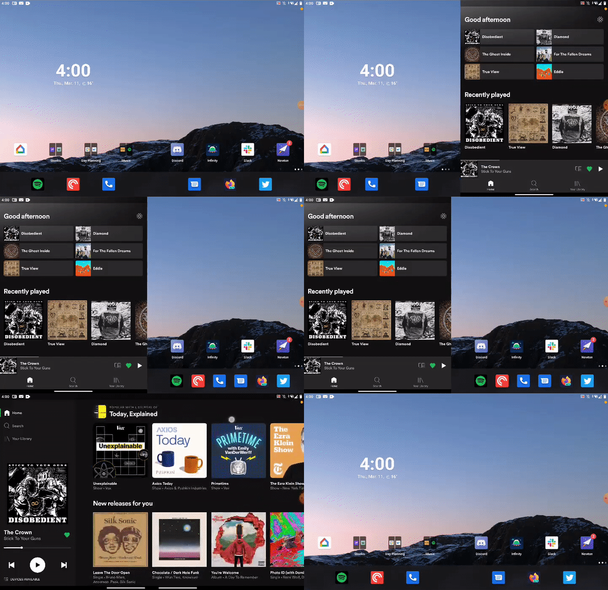
Surface Duo windowing in action (the hinge doesn’t show up in screenshots or recordings)
“If you do the windowing for the end-user, they don’t have to worry about sizing the window or positioning the window, it makes things a lot easier… We looked across the board of all the different technologies and we gravitated towards these two screens that were conjoined next to each other with a [360-degree] hinge,” Kyriacou said.
In practice, the system works relatively well. Using the Surface Duo feels a lot like using two phones simultaneously, except that it’s one cohesive device. When you tap an app on one screen, it opens on that screen. However, you can also quickly swipe an app from one display to another or even bridge a single app across both screens (although this has its own set of issues). Apps running on one display work as they would on any single-screened device — the main benefit is that you can view two apps at once, and both apps are more usable than, say, the split-screen modes available on some devices.
Careful concessions
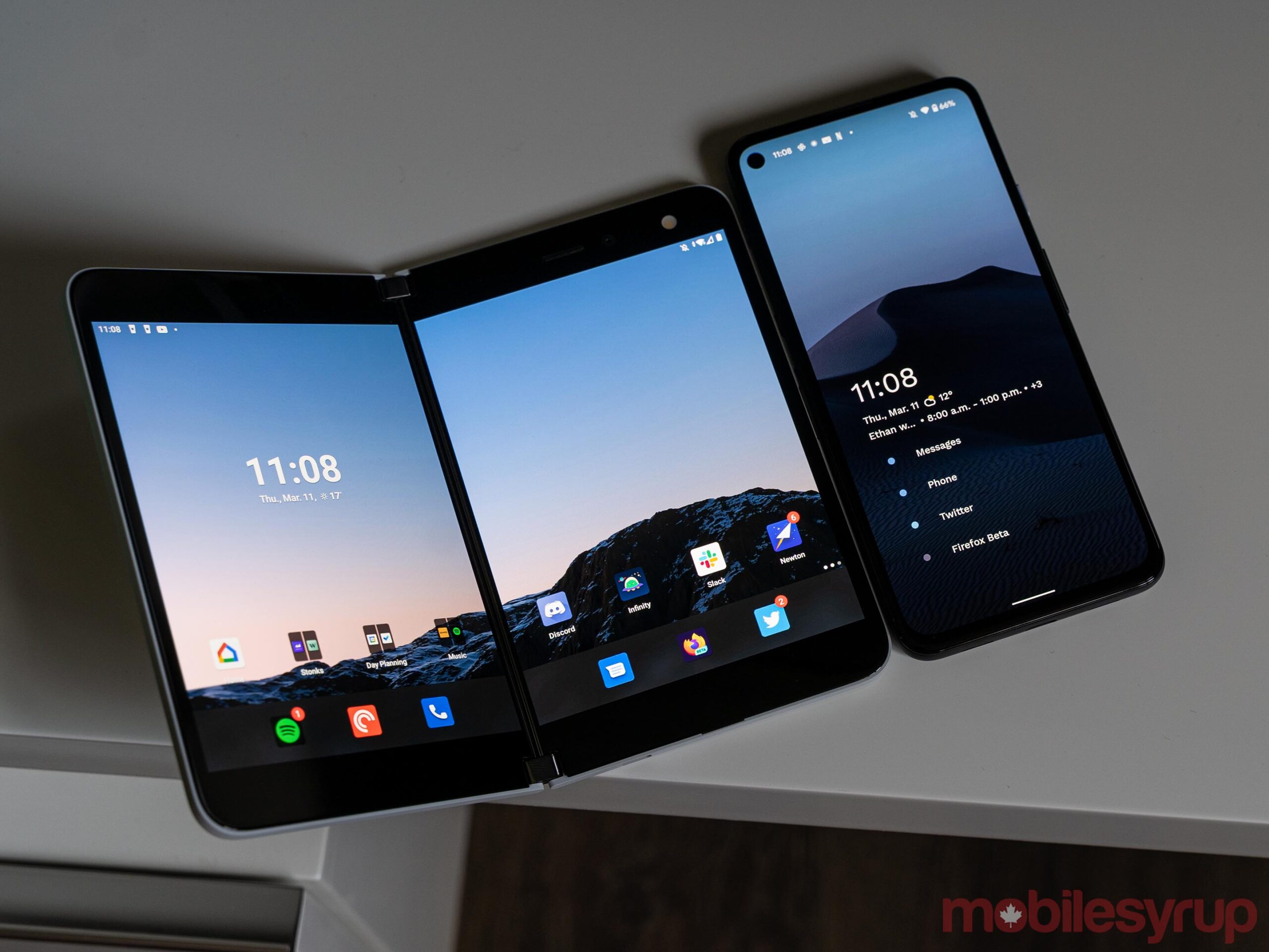
The Pixel 4a 5G sports a taller, narrower display than the Duo
Another reason to go with two separate displays instead of a single foldable screen was, as Microsoft calls it, ‘inking.’ Rumours abound about Samsung bringing the S Pen to its Galaxy Z Fold line, but the company has struggled to make it happen since foldable screens don’t use glass. But the Surface Duo uses two separate glass panels, which means it fully supports Microsoft’s Surface Slim Pen for writing on the screen. Unfortunately, I couldn’t test this myself — Microsoft didn’t include a pen with my Duo review unit. Still, if you’re a fan of digital writing, it’s a consideration worth making.
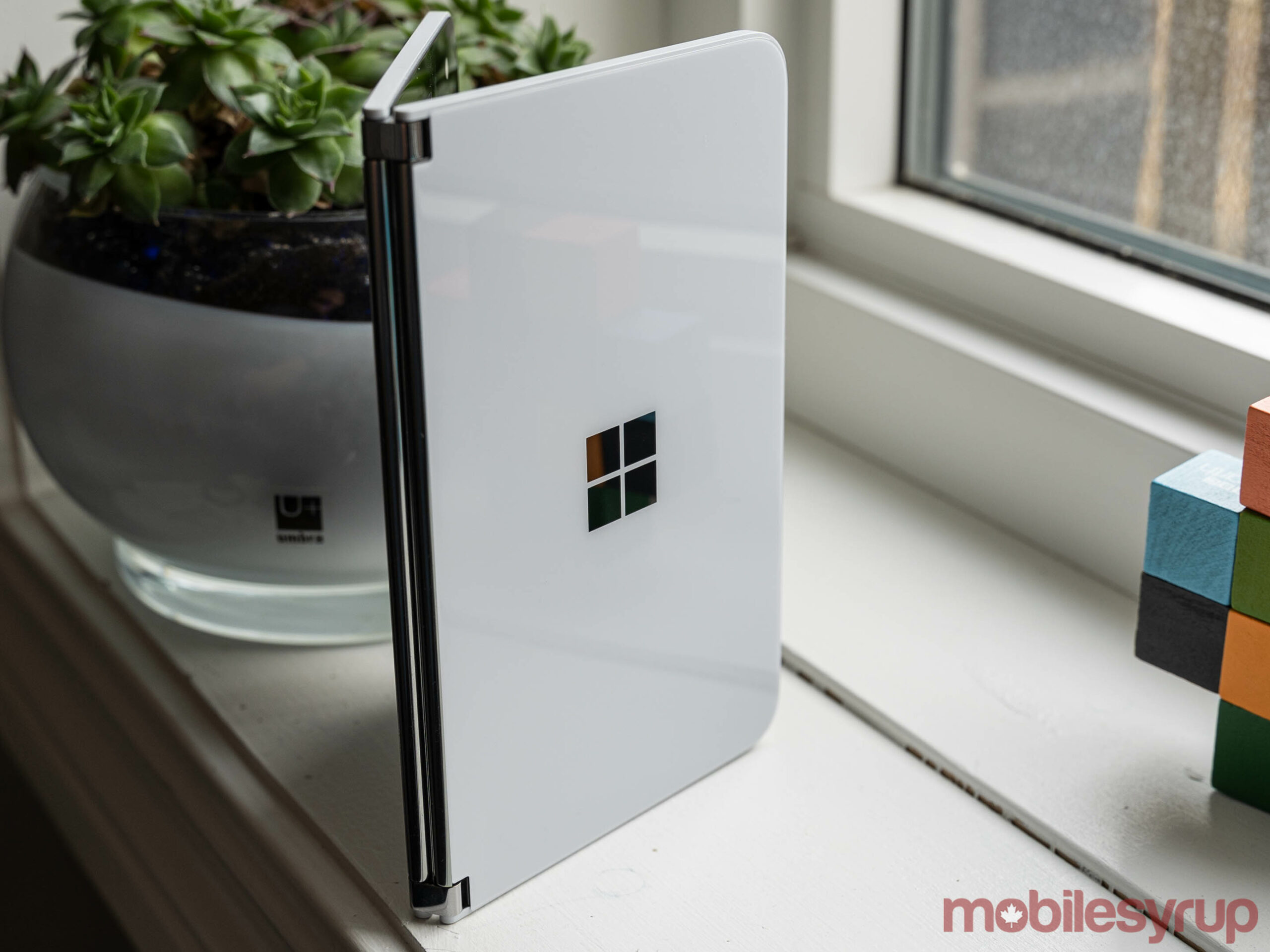
However, there are various concessions Microsoft made to achieve a two-screen system that is “useable.” For example, the company wanted the Duo to be pocketable, which meant it couldn’t be significantly thicker than a traditional phone.
“…Microsoft’s decision to use a Qualcomm Snapdragon 855 and stick with 4G LTE likely stems from the design goals”
Going back to Samsung’s Z Fold 2, it is effectively the same thickness as two Galaxy smartphones when you fold it. Microsoft made the Duo 4.8mm thick, which means it measures 9.9mm thick when you close it. For comparison, the Galaxy S21 is 7.9mm thick, the Pixel 4a 5G is 8.5mm thick and the Z Fold 2 is 6.9mm thick when unfolded and 16.8mm when folded.
The result is the Duo feels impressive when you hold it. It’s much thinner than other phones on the market, and when you fold it, it doesn’t feel significantly thicker than usual.
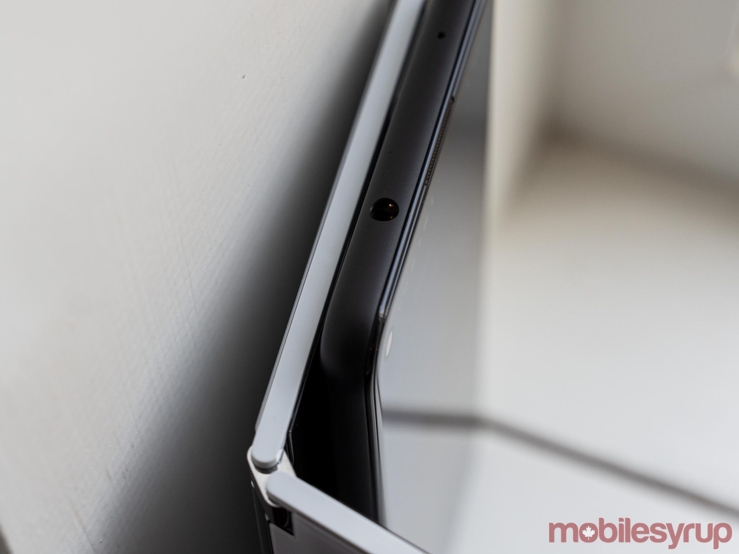
The Pixel 4a 5G is much thicker than one Surface Duo screen.
While the dimensions make the Duo feel better in hand, it also means Microsoft made concessions in other areas to get there. For example, the Surface Duo has an arguably small 3,577mAh battery. Although in my testing, the battery life was excellent, especially considering it powers two displays. Still, a thicker device likely would have allowed for a larger battery.
Likewise, Microsoft’s decision to use a Qualcomm Snapdragon 855 and stick with 4G LTE likely stems from the design goals. The thickness also constrained camera hardware — the Duo only offers an 11-megapixel selfie shooter, which doubles as a rear camera if you flip the screens around.
Kyriacou also noted that the Surface Duo’s width — each 5.6-inch screen is significantly wider than most phones thanks to their 4:3 aspect ratio — helped cram all the hardware into the thin frame.
Those 4:3 screens come in handy in other areas — for example, when using both screens together, users get a combined diagonal size of 8.1-inches and a 3:2 aspect ratio, just like on other Surface devices.
Android apps aren’t made for two screens…
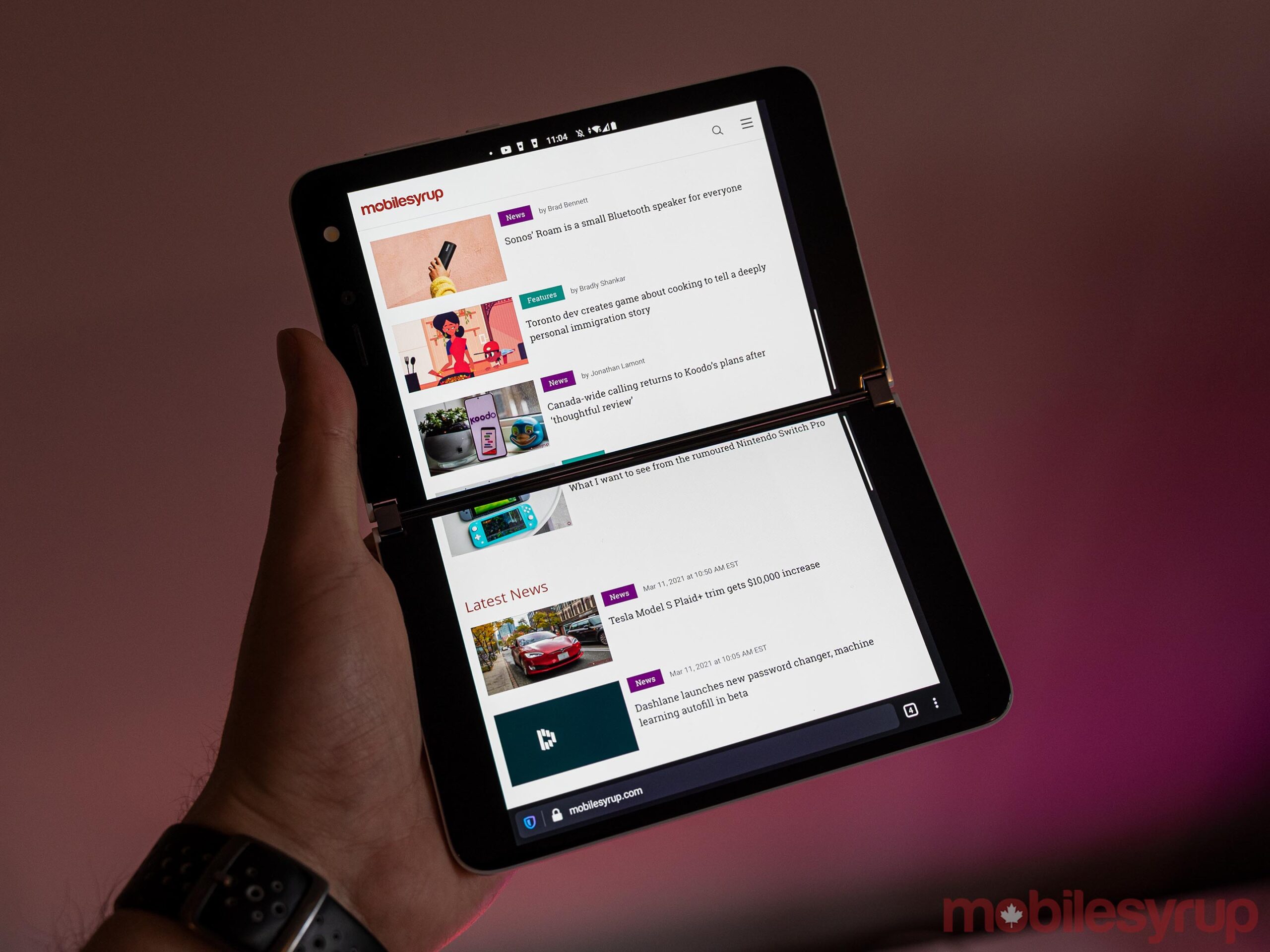
One app, two screens.
I found the extra space nice in practice, but most developers design Android apps for more traditional, tall aspect ratios like 16:9 or, in more recent trends, 21:9. In many cases, the extra width led to more empty space in apps, as they add padding between icons and other visual elements.
For that matter, one of the most significant issues I came across with the Surface Duo was software. Yes, there are plenty of bugs, but in my testing, none of the bugs amounted to more than some minor annoyance. Things like apps randomly closing when opened or the swipe gestures not registering input reliably, for example, hindered me but never significantly disrupted my ability to get things done. Other bugs, like one that causes the lock screen not to show up when opening the device, were more frustrating.
But I’ll take all the bugs happily if it means that apps actually make use of two screens. Aside from a small set of Microsoft apps, most don’t properly support two screens. As mentioned up top, if you open one app on one display, it works as normal. The issues pop up when you try to bridge that app across both screens for a larger, tablet-like experience. As far as the app can tell, it’s on one display — that means most apps don’t account for the screen gap, and you end up with content cut off or blocked by the hinge.
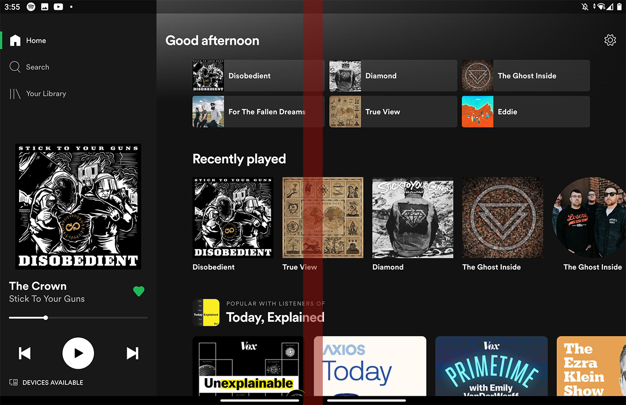
Screenshot of Spotify bridged across two screens on Duo — the red bar marks where the hinge cuts off content
In some apps, this wasn’t a big deal — Spotify, for example, just meant some album art was cut off. Scrolling a little would make it visible. Other apps got it worse — Google Calendar, for example, lost the middle of the ‘Wednesday’ column when in month view, rendering most of the events there unreadable. Microsoft’s Calendar app, on the other hand, automatically adjusts the month view so the hinge falls between the columns.
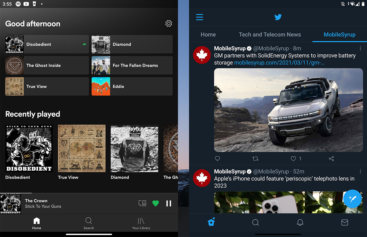
Screenshot of two apps on Surface Duo — note that the gap between the apps doesn’t show up on the device due to the hinge
Other than a few Microsoft apps, a small number of third-party apps adapted to a two-screen experience. But when I say small, I mean small. Only TikTok and a few ebook apps, like Amazon Kindle and Google Play Books, worked with two displays in my testing. For that matter, Play Books only seems to support dual displays when in a book — navigating the rest of the app is a pain when bridged across both displays.
The separate displays also mean you can’t use both panels to have a larger screen to watch Netflix or YouTube, which is annoying. The tradeoff is that you can put the video on one screen while you do stuff on the other, which I found helpful from time to time.

TikTok bridged across two screens on Duo
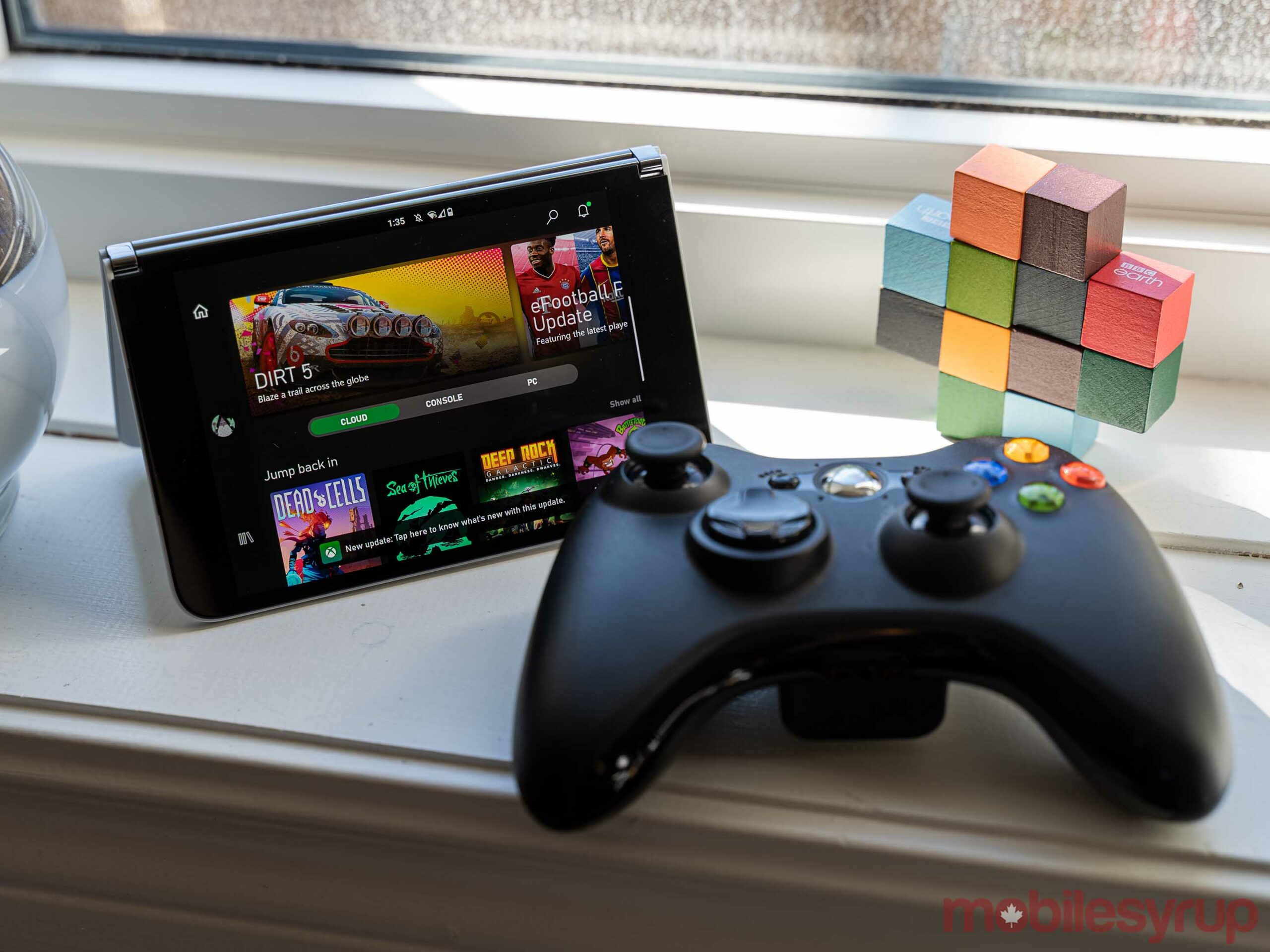
I was also surprised by some of the Microsoft apps that didn’t support two screens. Perhaps the biggest miss was the Xbox Game Pass app. I was excited for an xCloud gaming experience reminiscent of the Nintendo DS, with the touch controls on the bottom display and the game running on the top display. Unfortunately, the app doesn’t offer that kind of dual-screen support.
… But neither is Android
Although apps often frustrated me with their lack of support for the Duo, it’s hard to blame developers. The Duo is among the first two-screen devices available, with LG’s second display add-on for devices like the G8X, V60 and Asus’ ROG TwinView Dock for the ROG Gaming Phone 2 being other notable examples. With such a limited array of dual-screen devices, there’s little reason for developers to build apps that support the form factor.
Another factor to consider is that Android isn’t exactly built for devices with multiple screens, despite what Google may say. I think Microsoft’s effort with the Duo is admirable — the company essentially came into a new operating system and built a fairly comprehensive software layer to facilitate two screens in an environment designed for single-screen devices.
That the Duo’s windowing software works as well as it does is a testament to Microsoft’s engineers. At the same time, it’s far from perfect. We talked about bugs already, but I also found some issues with the consistency of Duo’s windowing logic.
By logic, I mean how the Duo handles when and where to open apps. To start, apps generally open on the screen you tap them on. This works consistently, and I have no complaints here. However, the Duo will also sometimes open an in-app page on the second screen.
When you create a new document in Microsoft’s Office app, for example, it’ll open on the second screen. This lets you easily view your different documents and notes side-by-side. Not all apps leverage the second panel like this, and almost every app that does, does so inconsistently. The Settings app, for example, opens the software update check menu on the second screen, but doesn’t operate any other menu from the app in the same way.
“Perhaps the most impressive part of the Surface Duo is that it manages to offer a generally good experience despite using older hardware”
Likewise, sometimes when I try to autofill login details with my password manager, it’ll open on the second screen. Other times, it opens on the same screen as the app I’m auto-filling.
The inconsistency creates confusion for users since it can be tricky to know what will happen when you tap something.
Solid performance and surprisingly good battery
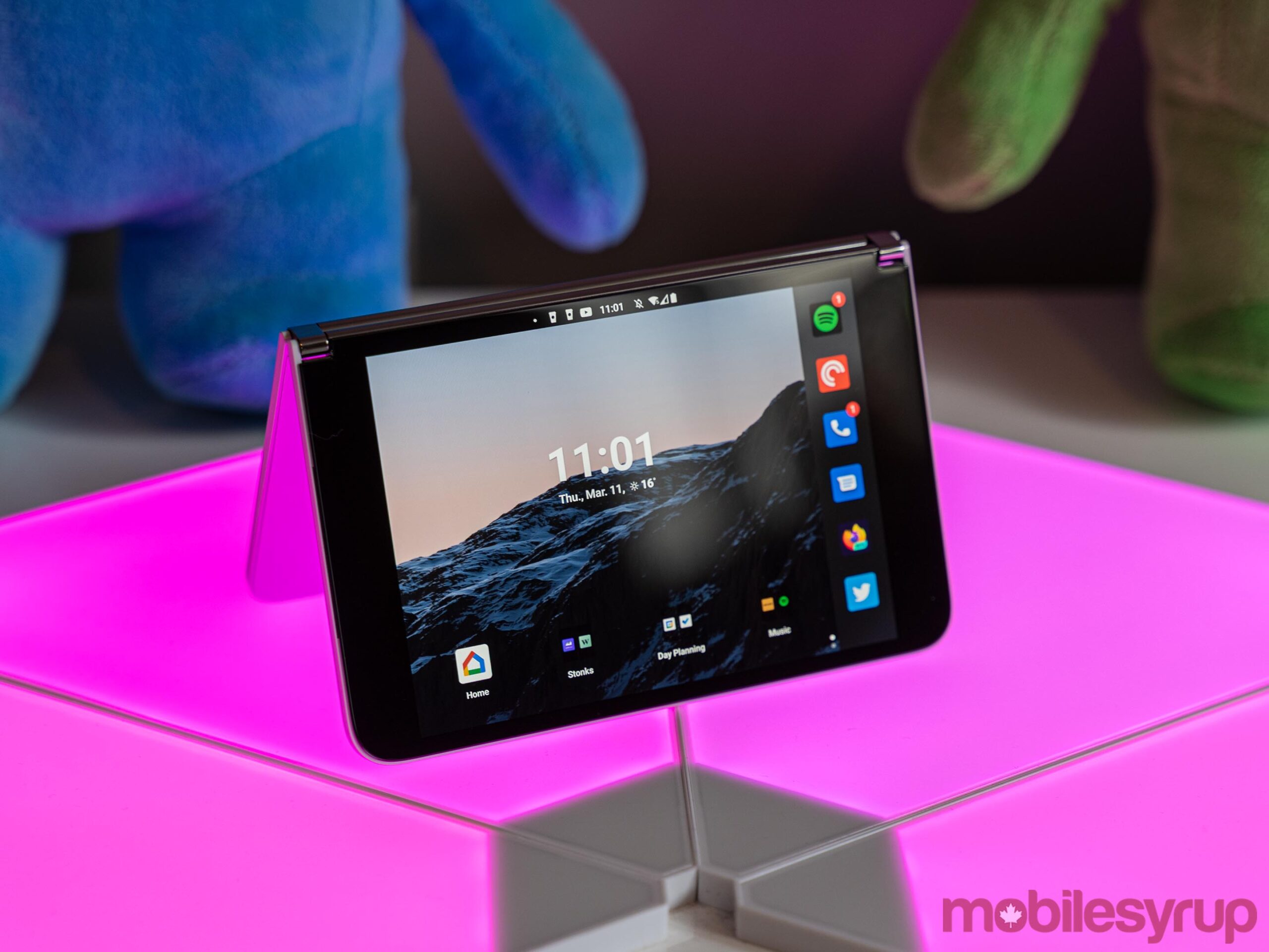
Perhaps the most impressive part of the Surface Duo is that it manages to offer a generally good experience despite using older hardware. Perhaps Qualcomm’s Snapdragon 855 was a better chip than people gave it credit for. After all, it did power some great phones — the Galaxy S10 series, for example, and the OnePlus 7 line. I have no complaints about it in the Surface Duo, other than to say that an older chip like that in a phone this expensive is frustrating. In practice, though, it performs very well.
While I don’t put much stock in benchmarks, I included a series of Geekbench 5 tests below comparing the Surface Duo with the OnePlus 7 Pro (another Snapdragon 855 device on Android 10, just like the Duo), the Pixel 4a 5G and, for context, Samsung’s Snapdragon 888-powered Galaxy S21. Although the Duo’s single-core and multi-core scores of 736 and 2,822 slightly outperform the OnePlus 7 Pro’s 732 and 2,793, they’re quite a bit worse than the S21’s 1,112 single-core score and 3,378 multi-core score. Unfortunately, I didn’t have a device with a Snapdragon 865 available to test, but looking to last year’s S20 Ultra review, it scored 800 points for single-core and 2,644 for multi-core. Surprisingly, that put the S20 Ultra slightly above the Duo in single-core and slightly below it in multi-core, which likely comes down to software optimization.
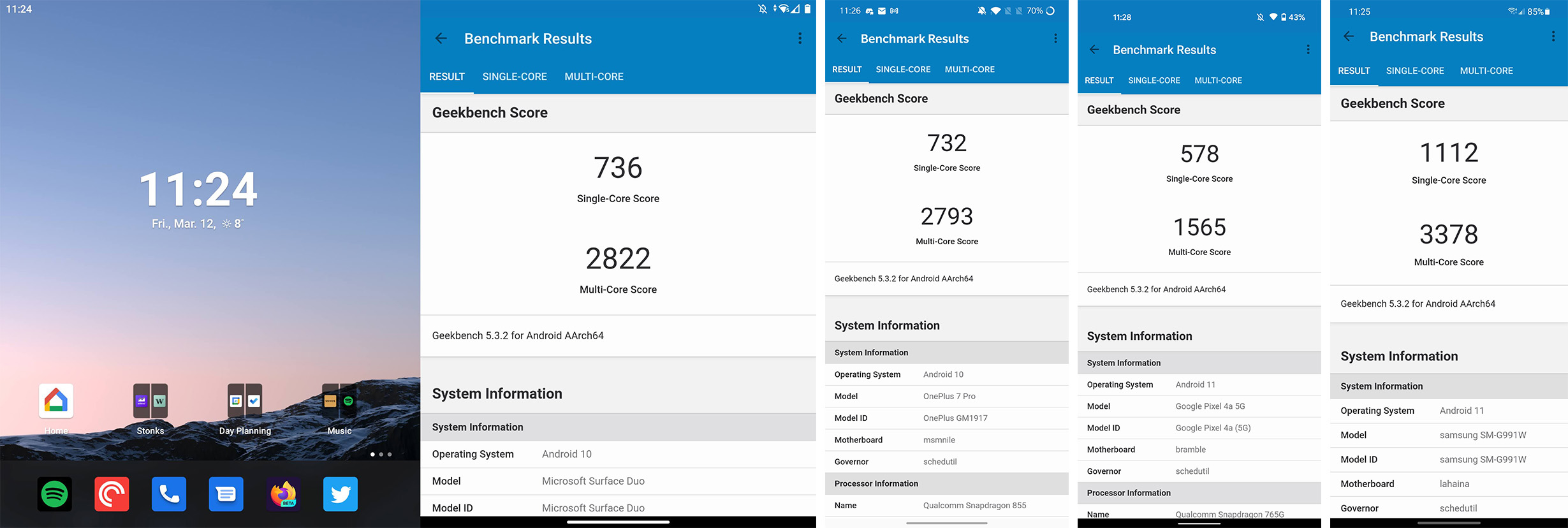
From left to right: Surface Duo, OnePlus 7 Pro, Pixel 4a 5G, Galaxy S21
On that same note, the 3,577mAh battery had a surprising amount of longevity, considering it powered two 5.6-inch screens. In my testing, the Surface Duo always made it through a day of use, usually with five or more hours of screen on time.
I suspect part of that may be that there’s no always-on display with the Duo. When not in use, I typically closed the Duo, which turned off both screens, and since closing it hides both panels, there’s no point in having an always-on display. However, Kyriacou also pointed to Microsoft’s work optimizing the hardware as the main reason for the excellent battery.
“We don’t go take something off the shelf, an Intel chip or an AMD chip or Qualcomm chip… We have what we call system integrators, who go to the third- and fourth-order level of the designs and engineering of these products. And that was the case here, all the way down to how we work with Qualcomm on [what’s called the] power floor when it gets down to its sleep state, our OLED manufacturers and what they’re doing with their pixels when they’re on and then also when they’re off,” Kyriacou said.
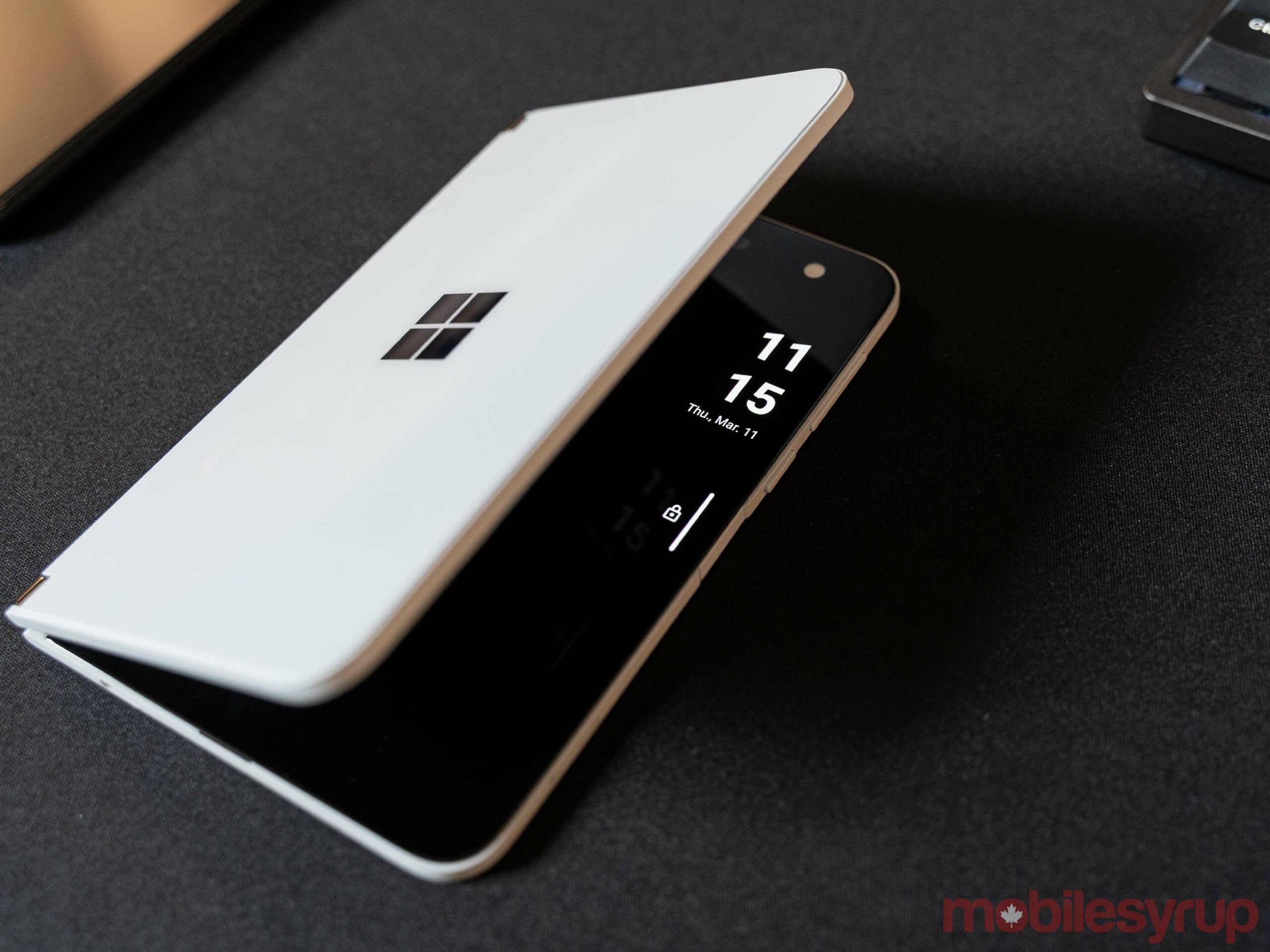
No always-on display, but if you crack the screen, Duo will let you peek at the time.
Despite generally good performance, the Duo wasn’t infallible. I encountered the odd hiccup and bout of lag, but it was much less than I anticipated, likely thanks to Microsoft’s optimization work.
My one other note about the Duo’s hardware is that it lacks any good way to view incoming notifications if you don’t have the screen open. In some ways, this is good — if you tend to check your phone too much, closing the screen can act as a good separation from the screen. For my part, I was always worried I’d miss something important if the screen was closed.
I can largely attribute that to the fact that I hate having my phone on vibrate and ring (mostly because Android frustratingly doesn’t let you set only certain things, like calls, to vibrate/ring). Even if I used vibrate, it’d have been great to see either a notification light like on Android phones circa 2006, or even a small external display so I could view incoming notifications or calls without needing to open the Duo.
You can take pictures with it, but you shouldn’t
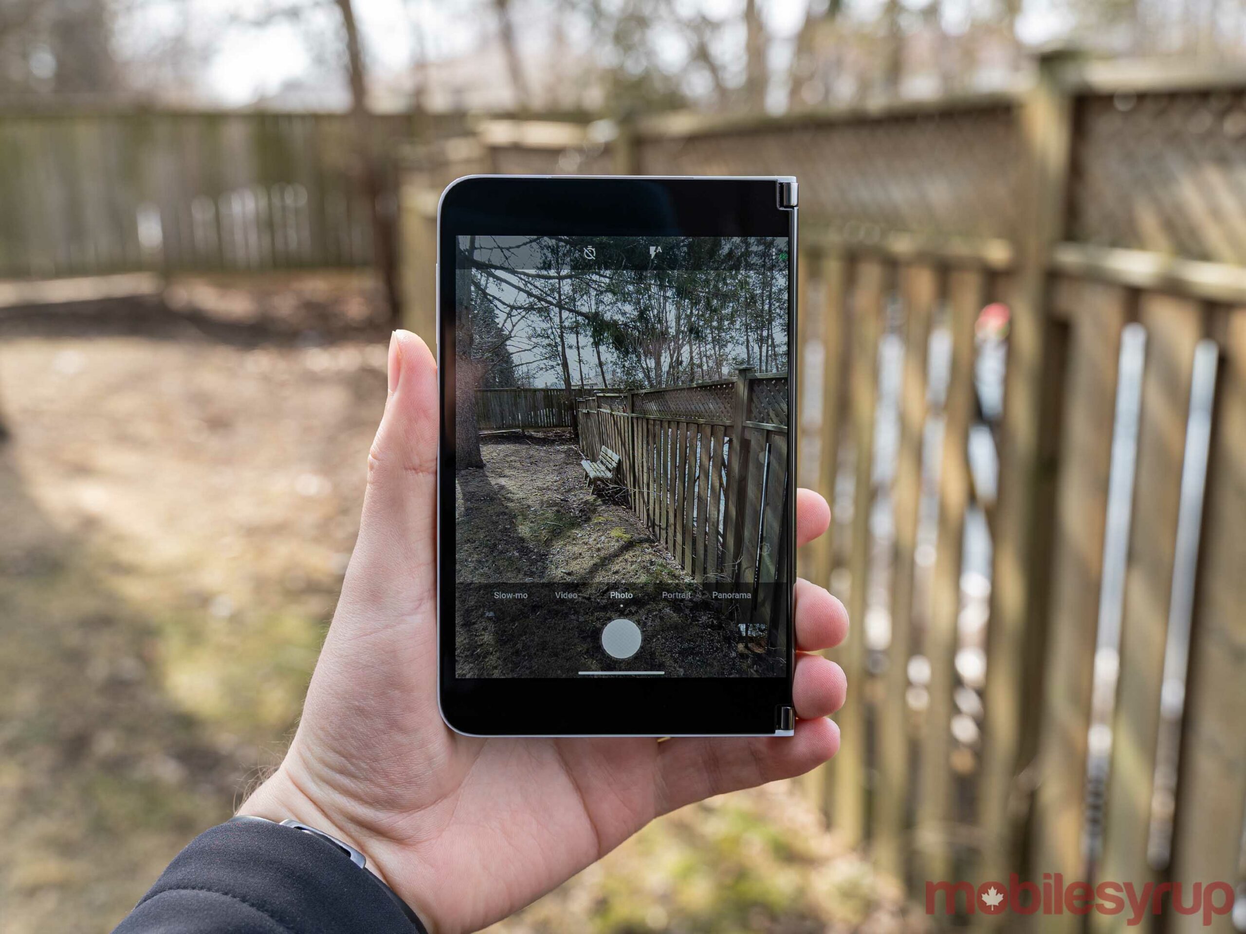
When it comes to the Surface Duo’s camera, potential buyers should temper their expectations. If you’re looking for a phone to handle your photography needs, the Duo is not the device.
In my tests, almost every shot was a miss, lacking detail, missing focus generally looking washed out. There were some shots where the Duo handled itself well, but those were few and far between.
But, even if the camera was better, I’m not sure I’d want to take pictures with the Duo anyway. Thanks to Microsoft’s decision to use one camera placed on the inside of the phone, taking pictures with the Duo is incredibly awkward. You have to flip the phone around, get it into single-screen mode on the display without the camera, and then you’re good to go. If you want to snap a quick picture, the Duo is not the device to use.
It’s also worth noting that since there are no secondary zoom lenses, like what you’d find on other flagships, the Duo relies entirely on digital zoom. Coupled with the mediocre camera hardware, it makes for abysmal zoom.

Taking selfies is less awkward, since the camera will usually be pointed at you anyway. And, quality aside, the position is decent for those who want to video chat. In fact, video calls are pretty great on Duo since you can have something else going on the other screen.
Ultimately, the camera is one of the Duo’s most significant weaknesses. But, like so many other issues with the phone, some people may be able to forgive the poor camera thanks to the multi-screen capabilities.
