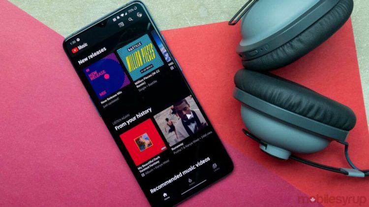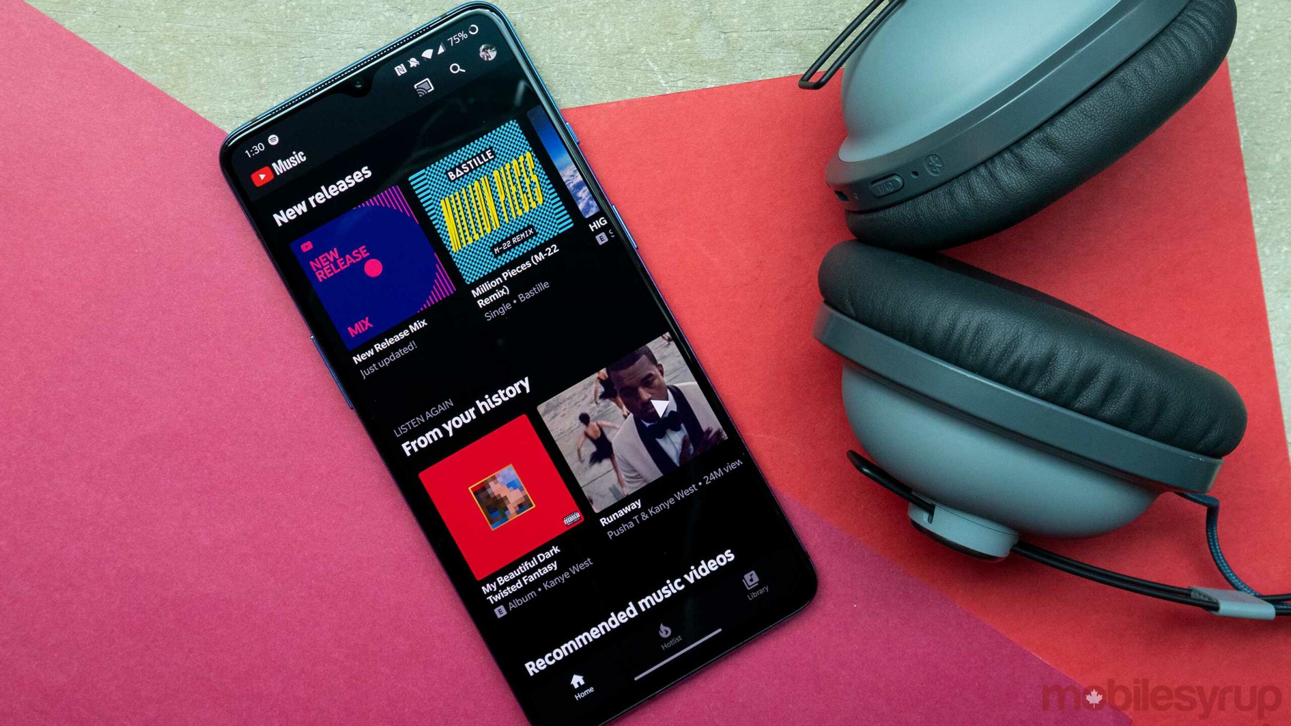

YouTube Music has slightly tweaked its dark theme on its web and Android apps, as noted by Reddit users and 9to5Google.
When the service first rolled out, it had started with a dark theme and still doesn’t have a light mode. The interface was primarily black with grey tones. However, some of the lighter grey parts are now black with the new redesign.
The Android status bar is now darker, and 9to5Google notes that the change is apparent in the Library tab and distinguishes the gray “Recent activity” carousel. Further, the results in the Explore tab, search and playlist pages blend in at the top.
Although these are small tweaks, they seem to create a more unified viewing experience for users. It appears that the changes started rolling out a few days ago.
Some have suggested that these changes could signify plans to implement a light theme for YouTube Music, as these tweaks would make it easier to invert the interface.
Source: 9to5Google
